As part of this month’s API theme, we will work with the Yelp API using R and Shiny to create a college search app to explore colleges near a specific city or zip code.
(Link to view Shiny app is added: https://anupamaprv.shinyapps.io/yelp_collegeapp/ )

Yelp College Search App
As you are all aware, Yelp is a platform which allows you to search for myriad businesses (restaurants, theme parks, colleges, auto repairs, professional services, etc… ) by name or location and (IMPORTANTLY) view honest reviews from customers who have used those services. With 135 million monthly visitors and 95 million reviews, it is equivalent (if not better) to Google reviews; a LinkedIn of sorts for businesses, if you consider it that way.
With the new academic year almost upon us, it makes sense that students and/or parents would benefit from using this site to explore their options, although it should NOT be relied as the only source of truth for educational or career decisions!
With that in mind, we will create a web application that will accept two user inputs and display results in an output window with three panes.
Inputs:
- City name or zip code
- Search radius
Output panes:
- Tab pane 1 – Display user selection as text output
- Tab pane 2 – Map view of the selected location with markers for each college.
- Tab pane 3 – Tabular view displaying college name, number of yelp reviews, overall yelp_rating and phone number of the college.
With that said, this tutorial will walk through the following tasks:
Step 1 – Working with Yelp API
Yelp uses the OAuth 1.0a method to process authentication, which is explained best on their developer website itself. A link is provided here. Like all API access requests, you will need a yelp developer account and create a dummy “app” to request permission keys from this developer page. Note, if you have never created a Yelp account, please do so now.
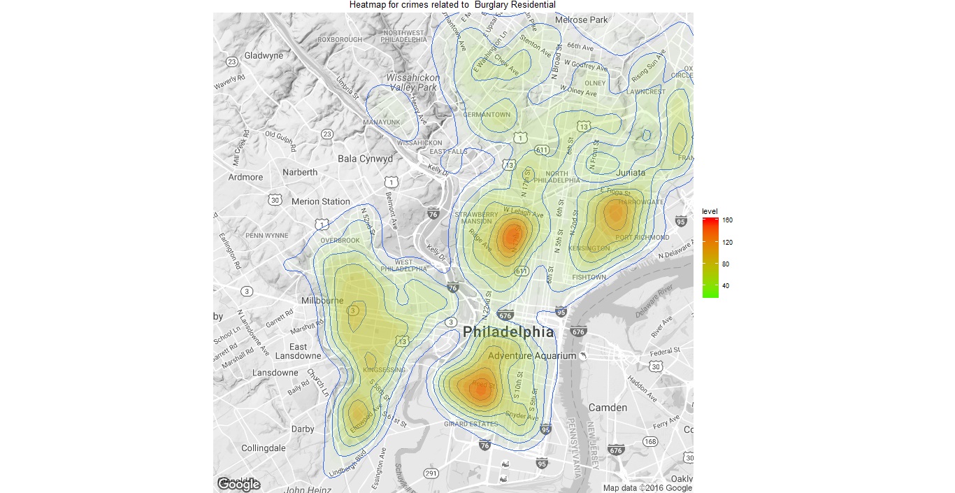
Unlike Facebook or Twitter API usage, we do not use any package specifically for Yelp. Instead we use the httr package which allows us to send a GET() request to the API. You can easily understand how to send queries by exploring the API console itself. However, to analyze or process the results, you do need a script. A sample query to search colleges near Philadelphia is as below:
1
| https://api.yelp.com/v2/search/?location=philadelphia&radius_filter=10000&category_filter=collegeuniv |
The steps to receive Yelp authorization are as follows:
- Store access tokens – Consumer_key, Consumer_Secret, Token and Token_Secret. Request clearance using code below:
- Process the results into json format and then convert to a usable dataframe
We want the query to be changed based on user inputs, so will put the query within a search function as below. The function will also convert the returned results from a nested list into a readable dataframe. To limit results, we will drop educational institutions with less than 3 reviews.
1
2
3
4
| yelp_srch <- function( radius_miles, locn, n )
{
# convert search radius into metres
radius_meters <- radius_miles*1609.34 |
# create composite Yelp API query
querycomposite2 <- paste0(api_part1, locn, api_part2, radius_meters, api_part3, sep = ”)
resultsout <- GET(querycomposite2, sig)
collegeDataContent = content(resultsout)
collegelist=jsonlite::fromJSON(toJSON(collegeDataContent))
collegeresultsp <- data.frame(collegelist)
colnames(collegeresultsp) = c(“lat_delta”, “long_delta”, “latitude”, “longitude”,
“total”, “claim_biz”, “yelp_rating”, “mobile_url”,
“image_url”, “No_of_reviews”, “College”, “image_url_small”,
“main_weblink”, “categories”, “phone”, “short_text”,
“biz_image_url”, “snippet_url”, “display_phone”,
“rating_image_url”, “biz_id”, “closed”, “location_city”)
varseln <- c(11,7,10,19 )
collegeset <- subset(collegeresultsp, select = varseln)
tk <- subset(collegeset, No_of_reviews > n)
rownames( tk ) <- seq_len( nrow( tk ) )
return(tk)
}
At this time, we are not adding any error handling functions since the processing occurs only when the user hits the “Analyze” button.
Step 2 – Creating the Shiny Application
Like all shiny applications, the ui.R file specifies the layout of the web application. As described in the introduction, we have the input tab on the left and 3-paned tabbed output on the right. The server.R file implements the logic and function calls to collate and format the data needed to populate the three panes.
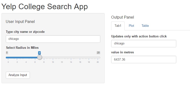
The input pane uses a text input and a slider input, both are which are straight forward implementations using the code provided in the official Shiny widget gallery.
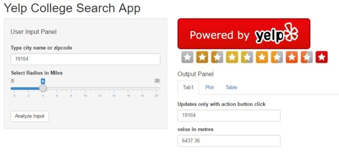
On the output pane, we display the Yelp logo and review_star images to indicate the data is being pulled from Yelp, and to comply with the display requirements under their Terms of Use. The first “Tab1” tab is also pretty simple and echoes the user input once the “analyze” button is entered.
Shiny app – input pane & output tab1
The second “Plot” pane creates a map plot of the location using the leaflet package. The pointer may be single or clustered based on how many results are returned. Note that the Yelp API limits results, so some queries may be truncated. It is also the explanation for providing a smaller range in the search radius slider input. The data for this pane is pulled directly from Yelp using a search function similar to the code provided at the beginning of this post.
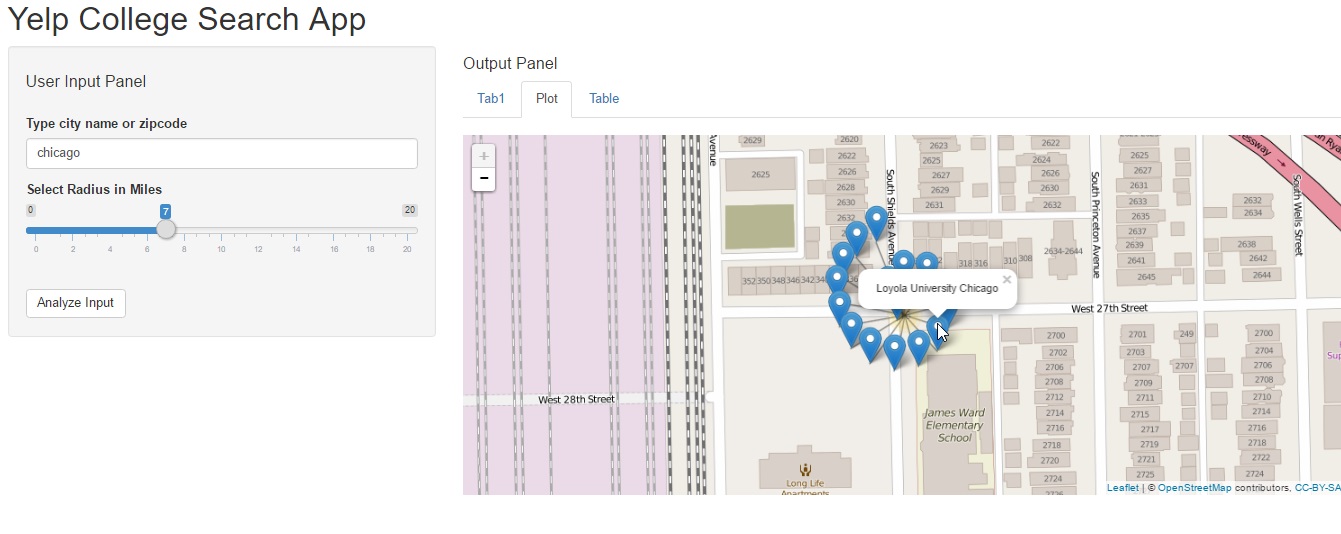
Shiny app output pane2
If you are interested in exploring more options with the leaflet view, like adding zoom capabilities or custom messages on the popup markers, then please take a look at this other post on our old blog – Graphical Data Exploration.
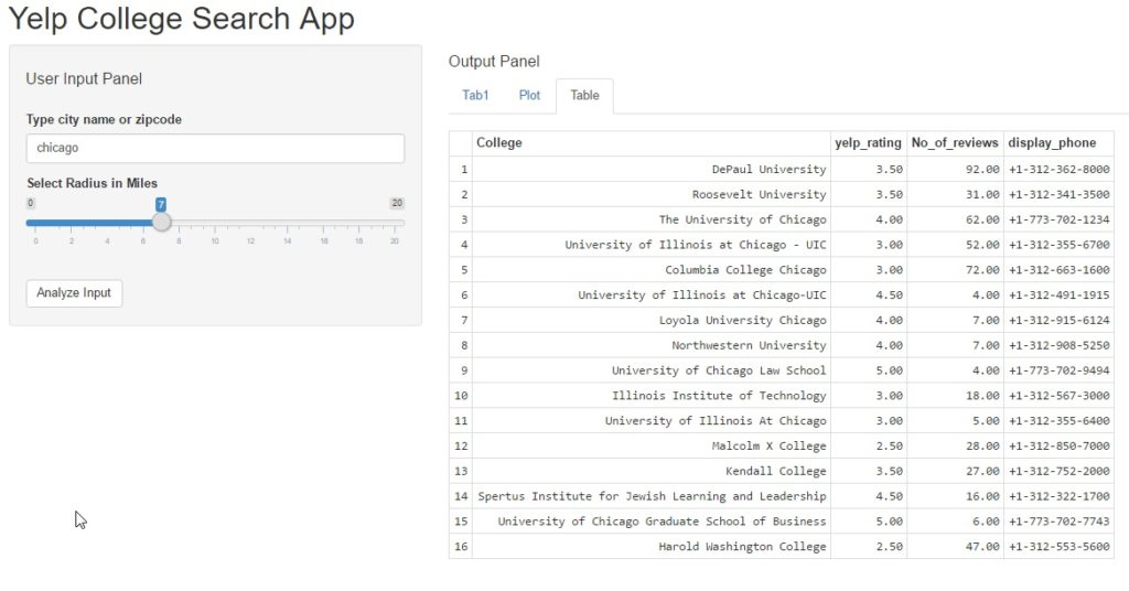
The third pane is a tabular view of search results using the yelp_srch() function added above.
Step 3 – Re-purposing the code
Honestly, this Yelp API code can be used for myriad other uses as below:
- Create a more detailed search app that allows users to add more inputs to search for other business categories or locations.
- Add dat from other APIs like Facebook to create an even more data-rich search directory with social proofs using Facebook likes, Yelp Star Rating, etc.
- If you are a hotel site, you could embed a yelp search app on your website to help users see a map view of restaurants and places on interest. This would help users realize how close they are to the historical sites/ major highway routes/ city downtown/ amazing entertainment options, etc.
- A travel website could plot a mapview of interactive itineraries, so users could select options based on whether they are travelling with kids/ seniors/ students, etc. while taking comfort in the knowledge that the places are truly worth visiting! 🙂
- Most APIs use OAuth methods for authentication, so you could easily modify the code to access data from other sites in an easy legal way. (Please do read the Terms of Service, though for any such usage).
As always, the entire source code for this analysis is FREELY available as yelp_api_project or can be forked from the link on Github. Please take a look and share your thoughts and feedback.
Until next time, adieu! 🙂