Deep dive into data analysis tools, theory and projects

Category: API programming

DataScience Portfolio Ideas for Students & Beginners

A lot has been written on the importance of a portfolio if you are looking for a DataScience role. Ideally, you should document your learning journey so that you can reuse code, write well-documented code and also improve your data storytelling skills.

DataScience Portfolio Ideas

However, most students and beginners get stumped on what to include in their portfolio, as their projects are all the same that their classmates, bootcamp associates and seniors have created. So, in this post I am going to tell you what projects you should have in your portfolio kitty, as well as a list of ideas that you can use to construct a collection of projects that will help you stand out on LinkedIn, Github and in the eyes of prospective hiring managers.

Job Search Guide

You can find many interesting projects on the “Projects” page of my website JourneyofAnalytics. I’ve also listed 50+ sources for free datasets in this blogpost.

In this post though, I am classifying projects based on skill level along with sample ideas for DIY projects that you can attempt on your own.

On that note, if you are already looking for a job, or about to do so, do take a look at my book “DataScience Jobs“, available on Amazon. This book will help you reduce your job search time and quickly start a career in analytics.

Since I prefer R over Python, all the project lists in this post will be coded in R. However, feel free to implement these ideas in Python, too!

a. Entry-level / Rookie Stage

  1. If you are just starting out, and are not very comfortable with even syntax, your main aim is to learn how to code along with DataScience concepts. At this stage, just try to write simple scripts in R that can pull data, clean it up and calculate mean/median and create basic exploratory graphs. Pick up any competition dataset on Kaggle.com and look at the highest voted EDA script. Try to recreate it on your own, read through and understand the hows and whys of the code. One excellent example is the Zillow EDA by Philipp Spachtholz.
  2. This will not only teach you the code syntax, but also how to approach a new dataset and slice/dice it to identify meaningful patterns before any analysis can begin.
  3. Once you are comfortable, you can move on to machine learning algorithms. Rather than Titanic, I actually prefer the Housing Prices Dataset. Initially, run the sample submission to establish a baseline score on the leaderboard. Then apply every algorithm you can look up and see how it works on the dataset. This is the fastest way to understand why some algorithms work on numerical target variables versus categorical versus time series.
  4. Next, look at the kernels with decent leaderboard score and replicate them. If you applied those algorithms but did not get the same result, check why there was a mismatch.
  5. Now pick a new dataset and repeat. I prefer competition datasets since you can easily see how your score moves up or down. Sometimes simple decision trees work better than complex Bayesian logic or Xgboost. Experimenting will help you figure out why.

Sample ideas –

  • Survey analysis: Pick up a survey dataset like the Stack overflow developer survey and complete a thorough EDA – men vs women, age and salary correlation, cities with highest salary after factoring in currency differences and cost of living. Can your insights also be converted into an eye-catching Infographic? Can you recreate this?
  • Simple predictions: Apply any algorithms you know on the Google analytics revenue predictor dataset. How do you compare against the baseline sample submission? Against the leaderboard?
  • Automated reporting: Go for end-to-end reporting. Can you automate a simple report, or create a formatted Excel or pdf chart using only R programming? Sample code here.

b. Senior Analyst/Coder

  1. At this stage simple competitions should be easy for you. You dont need to be in the top 1%, even being in the Top 30-40% is good enough. Although, if you can win a competition even better!
  2. Now you can start looking at non-tabular data like NLP sentiment analysis, image classification, API data pulls and even dataset mashup. This is also the stage when you probably feel comfortable enough to start applying for roles, so building unique projects are key.
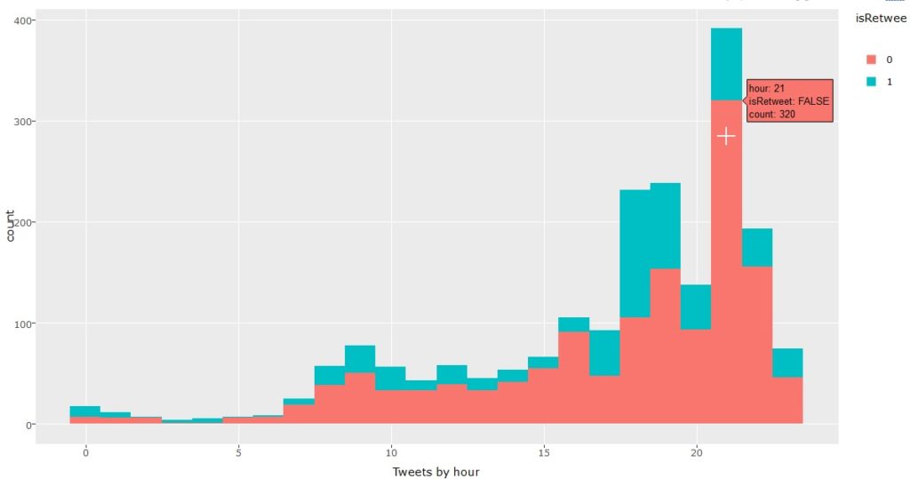
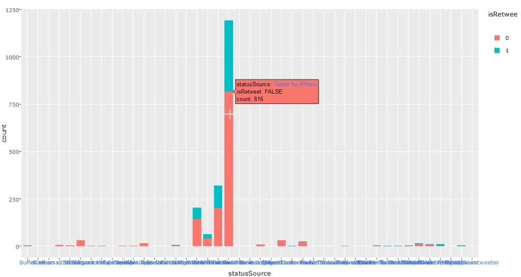
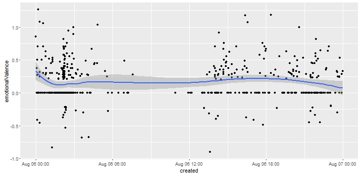
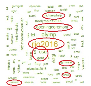
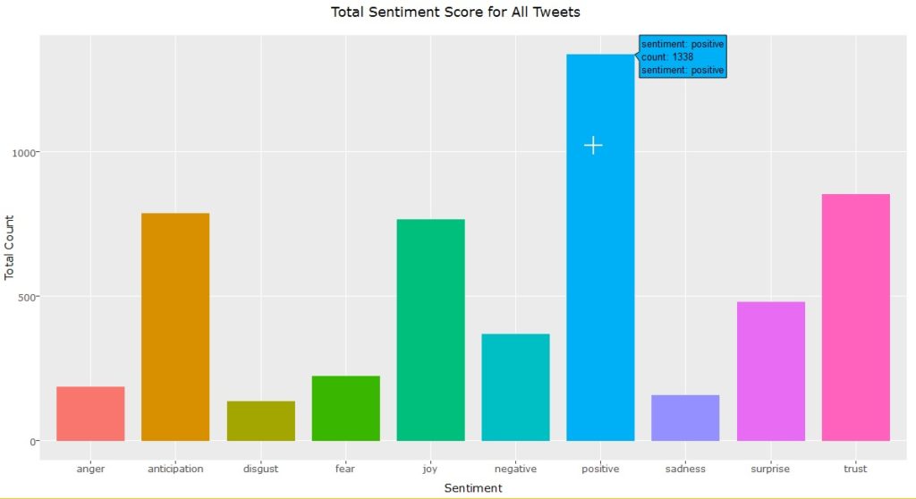
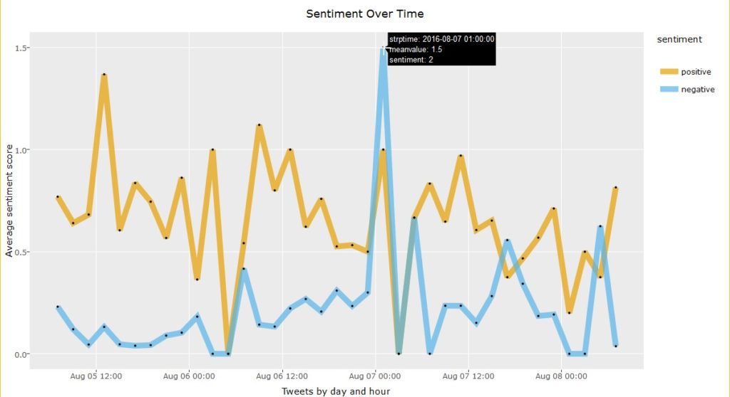
  3. For sentiment analysis, nothing beats Twitter data, so get the API keys and start pulling data on a topic of interest. You might be limited by the daily pull limits on the free tier, so check if you need 2 accounts and aggregate data over a couple days or even a week. A starter example is the sentiment analysis I did during the Rio Olympics supporting Team USA.
  4. You should also start dabbling in RShiny and automated reports as these will help you in actual jobs where you need to present idea mockups and standardizing weekly/ daily reports.
Yelp College Search App

Sample ideas –

  • Twitter Sentiment Analysis: Look at the Twitter sentiments expressed before big IPO launches and see whether the positive or negative feelings correlated with a jump in prices. There are dozens of apps that look at the relation between stock prices and Twitter sentiments, but for this you’d need to be a little more creative since the IPO will not have any historical data to predict the first day dips and peaks.
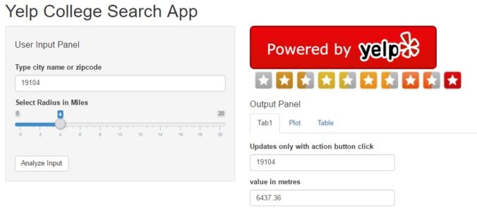
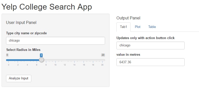
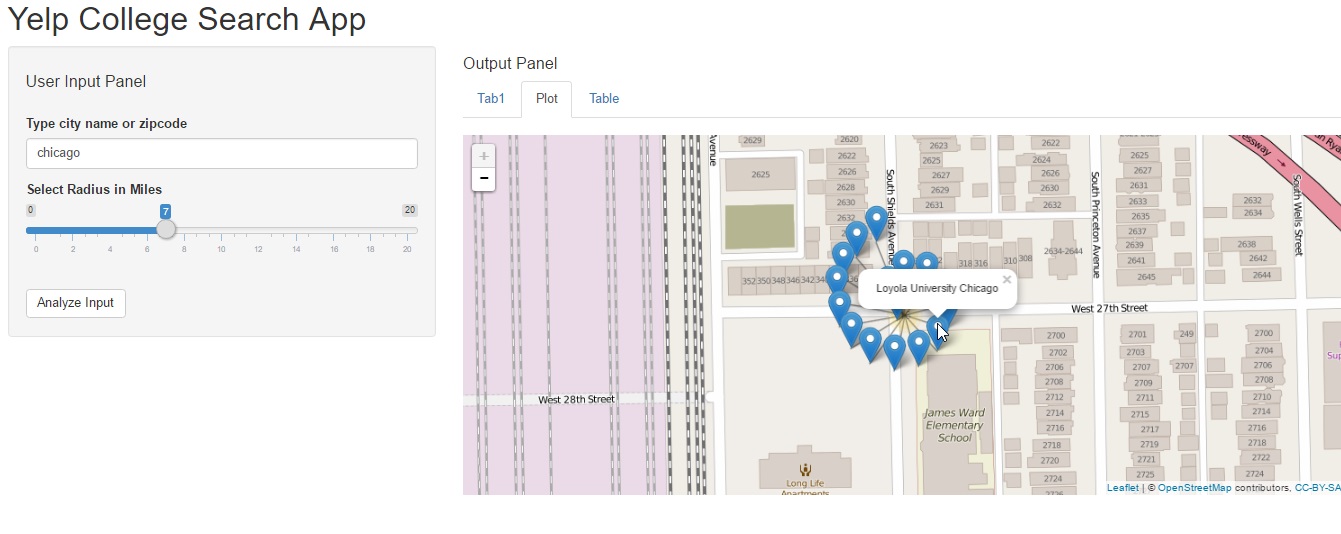
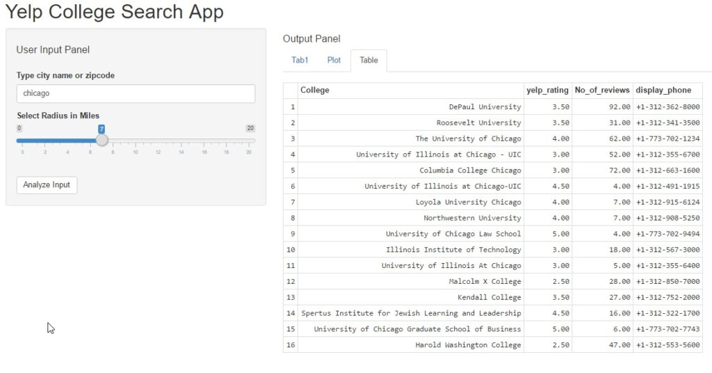
  • API/RShiny Project: Develop a RShiny dashboard using Yelp API, showing the most popular restaurants around airports. You can combine a public airport dataset and merge it with filtered data from the Yelp API. A similar example (with code) is included in this Yelp College App dashboard.
  • Lyrics Clustering: Try doing some text analytics using song lyrics from this dataset with 50,000+ songs. Do artists repeat their lyrics? Are there common themes across all artists? Do male singers use different words versus female solo tracks? Do bands focus on a totally different theme? If you see your favorite band or lead singer, check how their work has evolved over the years.
  • Image classification starter tutorial is here. Can you customize the code and apply to a different image database?

c. Expert Data Scientist

DataScience Expert portfolio
  1. By now, you should be fairly comfortable with analyzing data from different datasource types (image, text, unstructured), building advanced recommender systems and implementing unsupervised machine learning algorithms. You are now moving from analyze stage to build stage.
  2. You may or may not already have a job by now. If you do, congratulations! Remember to keep learning and coding so you can accelerate your career further.
  3. If you have not, check out my book on how to land a high-paying ($$$) Data Science job job within 90 days.
  4. Look at building Deep learning using keras and apps using artificial intelligence. Even better, can you fully automate your job? No, you wont “downsize” yourself. Instead your employer will happily promote you since you’ve shown them a superb way to improve efficiency and cut costs, and they will love to have you look at other parts of the business where you can repeat the process.

Sample project ideas –

  • Build an App: College recommender system using public datasets and web scraping in R. (Remember to check terms of service as you do not want to violate any laws!) Goal is to recreate a report like the Top 10 cities to live in, but from a college perspective.
  • Start thinking about what data you need – college details (names, locations, majors, size, demographics, cost), outlook (Christian/HBCU/minority), student prospects (salary after graduation, time to graduate, diversity, scholarship, student debt ) , admission process (deadlines, average scores, heavy sports leaning) and so on. How will you aggregate this data? Where will you store it? How can you make it interactive and create an app that people might pay for?
  • Upwork Gigs: Look at Upwork contracts tagged as intermediate or expert, esp. the ones with $500+ budgets. Even if you dont want to bid, just attempt the project on your own. If you fail, you will know you still need to master some more concepts, if you succeed then it will be a superb confidence booster and learning opportunity.
  • Audio Processing: Use the VOX celebrity dataset to identify the speaker based on audio/speech dataset. Audio files are an interesting datasource with applications in customer recognition (think bank call centers to prevent fraud), parsing for customer complaints, etc.
  • Build your own package: Think about the functions and code you use most often. Can you build a package around it? The most trending R-packages are listed here. Can you build something better?

Do you have any other interesting ideas? If so, feel free to contact me with your ideas or send me a link with the Github repo.

Twitter Sentiment Analysis

Introduction

Today’s post is a 2-part tutorial series on how to create an interactive ShinyR application that displays sentiment analysis for various phrases and search terms. The application accepts user a search term as input and graphically displays sentiment analysis.

In keeping with this month’s theme – “API programming”, this project uses the Twitter API to perform real-time search for tweets containing the user input term. Live App Link on Shiny website is provided and screenshot is as follows:

Twitter Sentiment Analysis Shiny

Shiny application for Twitter Sentiment Analysis

The project idea may seem simple at first, but will teach you the following skills:

  • working with Twitter API and dynamic data streaming (every time the search term changes, the program sends a new request to Twitter for relevant tweets),
  • Building an “interactive”, real-time application in Shiny/R,
  • data visualization with R

As always, the entire source code is also available for download on the Projects Page or can be forked from my  Github account here.


The tutorial is divided into  3 parts :

  1. Introduction
  2. Twitter Connectivity & search
  3. Shiny design


Application Design:

Any good software project begins with the design first. For this application, the design flowchart is shown below:

Design Flowchart for Shiny app

Design Flowchart for Shiny app


Twitter Connectivity

This is similar to the August project and mainly consists of two calls to the Twitter API:

  • authorize twitter api to mine data, using setup_twitter_oauth() function and your Twitter developer keys.

library(twitteR)
consumer_key = “ckey”
consumer_secret = “csecret”
access_token = “atoken”
access_secret = “asecret”
setup_twitter_oauth(consumer_key, consumer_secret, access_token, access_secret)

  • check whether the input search term returns tweets containing the phrase. If number of tweets <=5 return an error message. If number of tweets >5, process the tweets and display a sentiment analysis barchart. A custom function performs this computation

chk_searchterm <- function( term )

{  tw_search = searchTwitter(term, n=20, since=’2013-01-01′)

# look for all tweets containing this search term.

if(length(tw_search) <= 5)

{   return_term <- “None/few tweets to analyse for this search term. Please try again!” }

else

{    return_term <- paste(“Extracting max 20 tweets for Input =”, term, “.Sentiment graph below “)     }

return(return_term)

}

The bargraph is created by assigning numeric values for each of the positive and negative emotions using the tweet text. Emotions used – anger, anticipation, disgust, joy, sadness, surprise, trust, overall positive and negative sentiment.


Shiny webapp

The actual Shiny application design and twitter connectivity are explained in the next post.

Yelp College Search – Shiny Based App

As part of this month’s API theme, we will work with the Yelp API using R and Shiny to create a college search app to explore colleges near a specific city or zip code.

(Link to view Shiny app is added: https://anupamaprv.shinyapps.io/yelp_collegeapp/  )

Yelp College Search App

Yelp College Search App

As you are all aware, Yelp is a platform which allows you to search for myriad businesses (restaurants, theme parks, colleges, auto repairs, professional services, etc… ) by name or location and (IMPORTANTLY) view honest reviews from customers who have used those services. With 135 million monthly visitors and 95 million reviews, it is equivalent (if not better) to Google reviews; a LinkedIn of sorts for businesses, if you consider it that way.

With the new academic year almost upon us, it makes sense that students and/or parents would benefit from using this site to explore their options, although it should NOT be relied as the only source of truth for educational or career decisions!

With that in mind, we will create a web application that will accept two user inputs and display results in an output window with three panes.
Inputs:

  • City name or zip code
  • Search radius

Output panes:

  • Tab pane 1 – Display user selection as text output
  • Tab pane 2 – Map view of the selected location with markers for each college.
  • Tab pane 3 – Tabular view displaying college name, number of yelp reviews, overall yelp_rating and phone number of the college.


With that said, this tutorial will walk through the following tasks:

Step 1 – Working with Yelp API

Yelp uses the OAuth 1.0a method to process authentication, which is explained best on their developer website itself. A link is provided here. Like all API access requests, you will need a yelp developer account and create a dummy “app” to request permission keys from this developer page. Note, if you have never created a Yelp account, please do so now.

Unlike Facebook or Twitter API usage, we do not use any package specifically for Yelp. Instead we use the httr package which allows us to send a GET() request to the API. You can easily understand how to send queries by exploring the API console itself. However, to analyze or process the results, you do need a script. A sample query to search colleges near Philadelphia is as below:

1
https://api.yelp.com/v2/search/?location=philadelphia&amp;radius_filter=10000&amp;category_filter=collegeuniv

The steps to receive Yelp authorization are as follows:

  • Store access tokens – Consumer_key, Consumer_Secret, Token and Token_Secret. Request clearance using code below:
1
myapp sig resultsout
  • Process the results into json format and then convert to a usable dataframe

We want the query to be changed based on user inputs, so will put the query within a search function as below. The function will also convert the returned results from a nested list into a readable dataframe. To limit results, we will drop educational institutions with less than 3 reviews.

1
2
3
4
yelp_srch &lt;- function( radius_miles, locn, n )
{
# convert search radius into metres
radius_meters &lt;- radius_miles*1609.34

# create composite Yelp API query
querycomposite2 <- paste0(api_part1, locn, api_part2, radius_meters, api_part3, sep = ”)
resultsout <- GET(querycomposite2, sig)

collegeDataContent = content(resultsout)
collegelist=jsonlite::fromJSON(toJSON(collegeDataContent))
collegeresultsp <- data.frame(collegelist)

colnames(collegeresultsp) = c(“lat_delta”, “long_delta”, “latitude”, “longitude”,
“total”, “claim_biz”, “yelp_rating”, “mobile_url”,
“image_url”, “No_of_reviews”, “College”, “image_url_small”,
“main_weblink”, “categories”, “phone”, “short_text”,
“biz_image_url”, “snippet_url”, “display_phone”,
“rating_image_url”, “biz_id”, “closed”, “location_city”)

varseln <- c(11,7,10,19 )
collegeset <- subset(collegeresultsp, select = varseln)

tk <- subset(collegeset, No_of_reviews > n)
rownames( tk ) <- seq_len( nrow( tk ) )

return(tk)
}


At this time, we are not adding any error handling functions since the processing occurs only when the user hits the “Analyze” button.


Step 2 – Creating the Shiny Application

Like all shiny applications, the ui.R file specifies the layout of the web application. As described in the introduction, we have the input tab on the left and 3-paned tabbed output on the right. The server.R file implements the logic and function calls to collate and format the data needed to populate the three panes.

The input pane uses a text input and a slider input, both are which are straight forward implementations using the code provided in the official Shiny widget gallery.

On the output pane, we display the Yelp logo and review_star images to indicate the data is being pulled from Yelp, and to comply with the display requirements under their Terms of Use. The first “Tab1” tab is also pretty simple and echoes the user input once the “analyze” button is entered.

Shiny app output pane1

Shiny app – input pane & output tab1

The second “Plot” pane creates a map plot of the location using the leaflet package. The pointer may be single or clustered based on how many results are returned. Note that the Yelp API limits results, so some queries may be truncated. It is also the explanation for providing a smaller range in the search radius slider input. The data for this pane is pulled directly from Yelp using a search function similar to the code provided at the beginning of this post.

Shiny app output pane2

Shiny app output pane2

If you are interested in exploring more options with the leaflet view, like adding zoom capabilities or custom messages on the popup markers, then please take a look at this other post on our old blog – Graphical Data Exploration.

The third pane is a tabular view of search results using the yelp_srch() function added above.

yelp_app_pane3

Step 3 – Re-purposing the code

Honestly, this Yelp API code can be used for myriad other uses as below:

  • Create a more detailed search app that allows users to add more inputs to search for other business categories or locations.
  • Add dat from other APIs like Facebook to create an even more data-rich search directory with social proofs using Facebook likes, Yelp Star Rating, etc.
  • If you are a hotel site, you could embed  a yelp search app on your website to help users see a map view of restaurants and places on interest. This would help users realize how close they are to the historical sites/ major highway routes/ city downtown/ amazing entertainment options, etc.
  • A travel website could plot a mapview of interactive itineraries, so users could select options based on whether they are travelling with kids/ seniors/  students, etc. while taking comfort in the knowledge that the places are truly worth visiting! 🙂
  • Most APIs use OAuth methods for authentication, so you could easily modify the code to access data from other sites in an easy legal way. (Please do read the Terms of Service, though for any such usage).


As always, the entire source code for this analysis is FREELY available as yelp_api_project or can be forked from the link on Github. Please take a look and share your thoughts and feedback.

Until next time, adieu! 🙂

Twitter Analysis – Rio2016 Olympics

Twitter Analysis – Rio2016

Olympics season is in full swing. In keeping up with the spirit of this pinnacle of sports, we will use the Twitter API to extract tweets related to Rio2016 and analyze them to extract insights.

Rio OlympicsIn this post we will perform the following tasks:


Step 1 – Connecting to Twitter API

We will use R programming to perform the analysis using Twitter API keys (learn more about how to request these keys here) and the amazing “TwitterR” package to gain clearance permission for data extraction from the Twitter website.

Code for authorization is below:

1
setup_twitter_oauth(consumer_key, consumer_secret, access_token, access_secret)

Step 2 – Search Twitter API for specific tags

We will search Twitter for all tweets with the tag “#TeamUSA”.
Twitter puts some constraints on how much data can be extracted with each API call, so we limit our search to 2000 tweets. To ensure recency, we specify the tweets should have been posted after Aug 1, 2016. Code snippet below:

1
tw_search = searchTwitter('#TeamUSA', n=2000, since='2016-08-01', geocode='39.9526,-75.1652,50mi')

Note, the “geocode” option is optional in above command, but I added it to consider tweets from users whose profile location is Philadelphia, ensuring coverage by NBC/Fox are definitely picked up! We save the tweets in a RDS file for easy access.

1
 saveRDS(tw_search, 'USteam_olympics.rds')


Step 3 – Cleaning up and processing the tweets

First, we remove all special characters and emojis from tweets using the sapply() and iconv() function.

1
tweet_doc$text &lt;- sapply(tweet_doc$text,function(row) iconv(row, "latin1", "ASCII", sub=""))

We convert the created time to Brazil time. Note, Rio de Janeiro follows Chicago timezone, i.e 1 hour behind Philadelphia/NYC.

1
2
tweet_doc$Riotime = with_tz(tweet_doc$created, 'America/Chicago')
tweet_doc$strptime = as.POSIXct(strptime(tweet_doc$Riotime, "%Y-%m-%d %H:%M:%S"))

The as.POSIXct() allows us to aggregate tweets by hour/ date / minute, etc. which we can derive as below:

1
tweet_doc$day = as.numeric(format(tweet_doc$strptime, "%d"))

We add a  new variable to determine digital device type used for these Tweets, using the device url Twitter provides under column “StatusSource”.

1
2
3
par(mar = c(3, 3, 3, 2))
tweet_doc$statusSource_new = substr(tweet_doc$statusSource,  regexpr('&gt;', tweet_doc$statusSource) + 1,
regexpr('&lt;/a&gt;', tweet_doc$statusSource) - 1)


Step 4 – Graphical Insight

Plot 1: Tweets by hour of day:

1
2
gptime &lt;- ggplot(tweet_doc, aes(hour)) + geom_bar(aes(fill = isRetweet)) + xlab('Tweets by hour')
ggplotly(gptime)

We notice that number of tweets increase as the evening passes with peak frequency at about 9 pm CDT. (graph below)

Bar chart displaying frequency count of #TeamUSA tweets by hour

#TeamUSA tweets by hour

Plot 2: Tweets by device type:

1
2
gp &lt;- ggplot(tweet_doc, aes(x= statusSource , fill = isRetweet)) + geom_bar( )
ggplotly(gp)

The graph clearly shows iphones dominating the user base.

Tweets by device used

Tweets by device used


Plot 3: Emotional Valence

We extract the emotional sentiment of tweets using a custom function:

1
2
3
4
5
6
7
8
9
polfn = lapply(orig$text, function(txt) {
# strip sentence enders so each tweet is analyzed as a sentence,
# and +'s which muck up regex
gsub('(\\.|!|\\?)\\s+|(\\++)', ' ', txt) %&gt;%
# strip URLs
gsub(' http[^[:blank:]]+', '', .) %&gt;%
# calculate polarity
polarity()
})

Applying this, we get the most positive tweet:

“That looked like a very easy win for #TeamUSA  #beachvolleyball #Rio2016”

most negative tweet:

I think it’s a very odd sport but damn those guys are fit #Rio2016 #waterpolo #TeamUSA

Last, we plot a graph to display how emotionalValence change over the day:

Emotional valence change in tweets

Emotional valence change in tweets

Plot 4 : Word Cloud:

word cloud for #teamUSA tweets

word cloud for #teamUSA tweets

We use the “text” column from tweet_doc object to create a word dictionary of the tweets after removing punctuation and unwanted characters. The size of the words increases with their frequency of appearance in the tweets. The image alongside shows such a wordcloud with highlighted words indicating high-frequency phrases.

1
2
3
4
wordCorpus &lt;- Corpus(VectorSource(tweet_doc$text))
wordCorpus &lt;- tm_map(wordCorpus, removePunctuation)
wordcloud(words = wordCorpus, max.words=500, random.order=FALSE,
rot.per=0.35, use.r.layout=FALSE, colors=pal)


Plot 4 : Sentiment Graph:

We use the “syuzhet” library to assigns emotional value to each of the 2000 tweets we extracted using the get_nrc_sentiment() function.

1
mySentiment &lt;- get_nrc_sentiment(tweet_doc$text)

This assigns a numeric value to each tweet to indicate various emotions expressed in the tweet – anger, anticipation, fear, joy, etc. We then add these values back to the tweet_doc object and compute column totals to derive the overall weight for each emotion. Code and image for overall sentiment scores are shown below:

1
2
3
4
ggplotly(ggplot(data = sentimentTotals, aes(x = sentiment, y = count)) +
geom_bar(aes(fill = sentiment), stat = "identity") +
theme(legend.position = "none") +
xlab("Sentiment") + ylab("Total Count") + ggtitle("Total Sentiment Score for All Tweets"))


Overall Sentiment Scores - #TeamUSA

Overall Sentiment Scores – #TeamUSA

We can also use the scores to see if positive/negative sentiments change with time of day or date. For our tag “#TeamUSA” we notice this is patently true as seen in graph below:
Positive tweets peak at noon on Opening Ceremony day (aug 5) and negative sentiments peaked on Aug 7 morning.

Sentiment by time

Sentiment by time


Step 5 – Usage for Brand monitoring.

The steps used in the analysis above can be easily modified for monitoring your brand, blog or product, as explained below:

  • Instead of “#TeamUSA” we can use any other tag or company/blog  name or product or any other relevant tags to mine Twitter for tweets.
  • Periodically monitor the tweets about your product or brand to ensure that your “sentiment graph” always tends to positive emotions. If not, ensure your staff is working diligently to counter any negative tweets/ concerns among your users.
  • The graphical analysis for “Tweets by hour of day ” could be used to monitor what time your users/ audience is most active. You could use this insight to publish more content during this time and to ensure your customer support is always available during this period to effectively engage your audience.
  • If your “device type” graph indicates any specific device (e.g: specific Android phone brands) make sure your content caters correctly for mobile users.
  • The high-frequency words in “wordcloud” indicate trending topics, so these can be used as great ideas for new content topics or short-term ads to ride the publicity wave! 🙂


The entire source code for this analysis is available here blog_twitter_olympics or can be forked from the Github page. Please take a look and share your thoughts and feedback. Until next time, adieu! 🙂

August Project Updates

Hello All,

The theme for August is API programming for social media platforms.

working with twitter API

twitter API code with R/ Python

For the August project, I’ve concentrated on working with Twitter API, using both Python and R programming. The code can be downloaded from the Projects Page or forked from my Github account.

Working With APIs:

Before we learn what the code does, please note that you will first need to request Twitter developer tokens (values for consumer_key, consumer_secret, access_key and access_secret) to authorize your account from extracting data from the Twitter platform. If you do not have these tokens yet, you can easily learn how to request tokens using the excellent documentation on the Twitter Developer website . Once you have the tokens please modify these variables at the beginning of the program with your own access.

Second, you will need to install the appropriate twitter packages for running programs in Python and R. This makes it easy to extract data from Twitter since these packages have pre-written functions for various tasks like Twitter authorization, looking up usernames, posting to Twitter, investigating follower counts, extracting profile data in json format, and much more.

“Tweepy” is the package for Python and “twitteR” for R programs, so please install them locally.


Tracking Twitter Follower Growth:

Although Twitter provides a great way to view your own twitter follower growth, there is no way to download or track this data locally. The Python program ( twitter_follower_ct_ver4.py) added in this month’s code does just that – extracts follower count and store it to csv Excel file. This makes it possible to track (historical) growth or decline of Twitter follower count over a period of time, starting from today.

With this program that you can monitor your own account and other twitter handles as well! Of course, you can’t go back in time to view older counts, but hey, at least you have started. Plus, you can manually add values for your own accounts.

Track Twitter follower count

File tracking Twitter follower count

(Technically, for twitter handles you do not own, you could get the date of joining of every follower and then deduce when they possibly followed someone. A post for another day, though! )

Extracting Data about Twitter Followers

Follower count is great, but you also want to know the detailed profile of your followers and other interesting twitter accounts. Who are these followers? Where are they located?

There are 2 R programs in the August Project which help you gather this information.

The first (followers_v2.R) extracts a list of all follower ids for a specific twitter account and stores it to a file. Twitter API has a rate limit of 5000 usernames for such queries, so this program uses cursor pagination to pull out information in chunks of 5000 in each iteration. Think of the list of follower ids like the content on a book – some books are thicker, so you have turn more pages! Similarly, if a twitter account has very few followers, the program completes in 1-2 iterations!

The program example works on the twitter account “@phillydotcom” which has >180k followers.  The cursor iteration process itself is implemented using a simple “while” loop.

Twitter follower details

Twitter follower details

The second R program ( dets_followers_v2.R ) uses the list of follower_ids to pull in detailed information about followers. For the scope of this project I am only deriving screen name, username, location and follower count for all of my Followers. Details are stored in a tabular format as shown in image alongside. You can avail this data to geographically segment your Twitter followers, analyze “influencer” followers (users with 25000 or more followers) and lots more.

Please take a look at the code and provide your valuable feedback and comments in the comments section.

Twitter
Visit Us
Follow Me
LinkedIn