Journey of Analytics

Deep dive into data analysis tools, theory and projects

Page 7 of 8

Password Strength Analysis – a Tutorial on Text Analysis & String Manipulation

In this post we will learn how to apply our data science skills to solve a business problem – namely why passwords get stolen or hijacked?
This post is inspired from a blog entry on Data Science Central, where the solution was coded in Python. (Our analysis will use R programming and extend the original idea)

In this tutorial, we will explore the following questions:

  1. What are the most common patterns found in passwords?
  2. How many passwords are  banking type “strong ” combinations (containing special characters, length >8) ?
  3. How many passwords make excessive use of repetitive characters, like “1111”, “007”, “aaabbbccc” or similar.


Remember, this is a “real-world” dataset and this type of list is often used to create password dictionaries. You can also use it to develop your own password strength checker.


Overall, this tutorial will cover the following topics:

  1. basic string functions: stringlength, stringsearch, etc.
  2. data visualization using pie charts, histograms,
  3. Color coded HTML tables (similar to Excel) – a great feature if you plan to create Shiny Webapps with Tables.
  4. Weighted ranking.


So let’s get started:


What makes a “Strong” password?

First let us take a look at the minimum requirements of  an ideal password:

  1. Minimum 8 characters in length.
  2. Contains 3 out of 4 of the following items:
    • Uppercase Letters
    • Lowercase Letters
    • Numbers
    • Symbols


Analysis Procedure:


  1. Load input (password data) file:

TFscores = data.frame(fread(“C:/anu/ja/dec2016/passwords_data.txt”, stringsAsFactors = FALSE, sep = ‘\n’, skip = 16))


2. Calculate length of each password:

TFscores$len = str_length(TFscores$password)


3. Plot histogram to see frequency distribution of password lengths. Note, we use a custom for-loop to generate labels for the histogram.

hist(TFscores$len, col = “blue” , ylim = c(0, 150000),

main = “Frequency Distribution – password length”,

xlab = “Password Length”,  ylab = “Count / Frequency”, labels = lendf$labelstr)
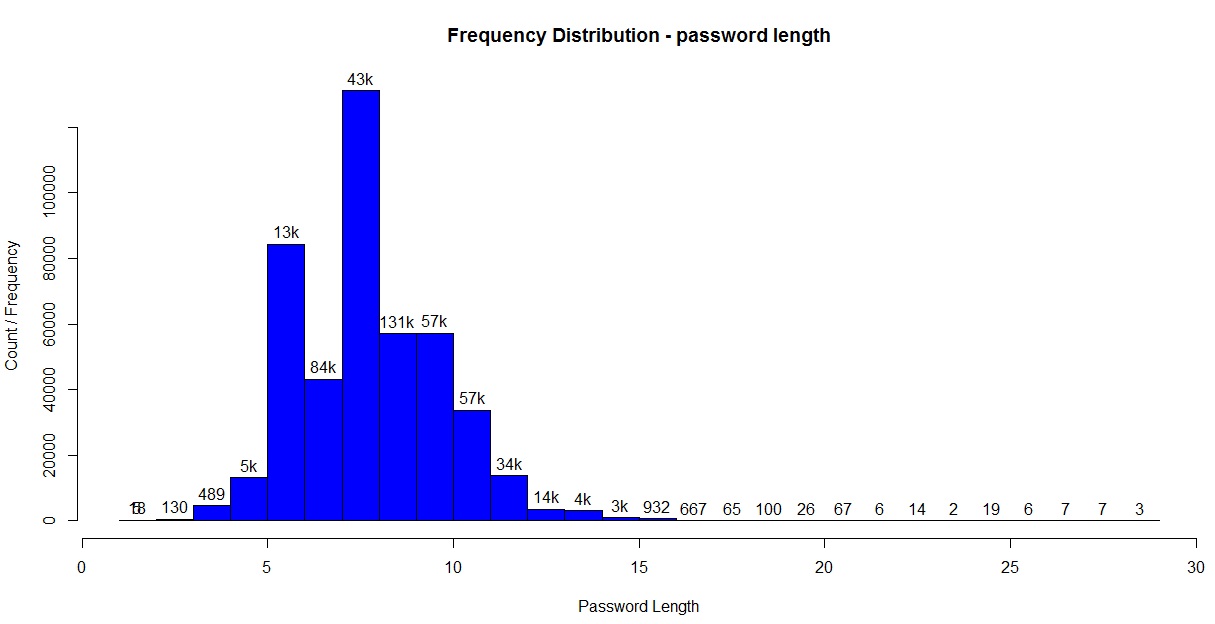
Histogram for password lengths

Histogram for password lengths


4.

a. Calculate number of digits in each password.
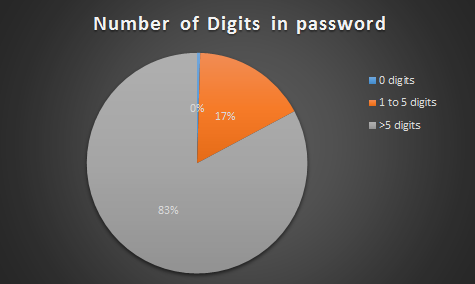
number of digits in password

number of digits in password

TFscores$strmatch = gsub(pattern = “[[:digit:]]”, replacement = “”, TFscores$password)

TFscores$numberlen = TFscores$len – str_length(TFscores$strmatch)

b. Similarly calculate number of characters from other character classes:

  • Upper case alphabets
  • Lower case alphabets
  • Special characters – ! ” # % & ’ ( ) * + , – . / : ;


5. Assign 1 point as password strength “rank” for every character class present in the password.  As mentioned earlier, an ideal password should have at least 3 character classes.

TFscores$rank = TFscores$urank + TFscores$lrank + TFscores$nrank +   TFscores$srank

Let us take a look to see how the passwords in our list stack up:

pie(piedfchar$Var1,labels = labelarrchar , col=rainbow(9),  main=”no. of Character classes in password”)
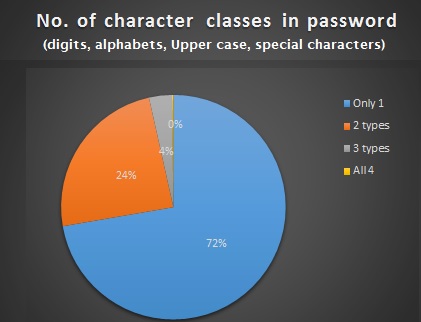
 

password strength analysis

password strength analysis

6. Count number of unique characters in password :


Note, this function is resource intensive, and takes couple of hours to complete due to size of the dataset.
To reduce the time/effort , the calculated values are added to the zipfolder, titled “pwd_scores.csv”.

 length(unique(strsplit(tempx$password, “”)[[1]]))


7. Assign  password strength category based on rank and length:

TFscores$pwdclass = “weak”   #default

TFscores$pwdclass[TFscores$len < 5 | TFscores$rank == 1 ] = “very weak”

TFscores$pwdclass[TFscores$len >= 8 & TFscores$rank >=2] = “medium”

TFscores$pwdclass[TFscores$len >= 12] = “strong”

TFscores$pwdclass[TFscores$len >= 12 & TFscores$rank == 4] = “very strong”

Based on this criteria, we get the following frequency distribution:
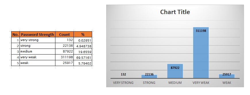
password strength

password strength

7. We can derive the following insights from steps 5 and 6:

  • 77.68% of passwords are weak or very weak!
  • ~3% of passwords have less than 5 characters.
  • ~72% of passwords have less only 1 type of character class.
  • 0.5% of passwords have 8+ characters yet number of unique characters is less than 30%.
  • ~0.9% of characters have less than 4 unique characters.
  • 72% of passwords contain only digits.

8. Let’s see if there are any patterns repeated in the passwords, like “12345”, “abcde”, “1111”, etc:

TFscores$strmatch = regexpr(“12345”, TFscores$password)

pwd with years

password with year prefixes.

  • 1.2% of passwords contain pattern “12345”.
  • 0.01% of passwords contain pattern “abcde”.
  • 0.3% of passwords contain pattern “1111”.
  • 0.02% of passwords contain pattern “1234”.
  • 15% of passwords contain year notations like “198*”, “197*”, “199”, “200*”. Sample shown alongside clearly shows that many people use important years from their life for their passwords. (logically true!)


9. View the password strength visually. We use the “condformat” function to create an HTML table that is easy to assimilate:

condformat(testsampledf) +  rule_fill_discrete(password, expression = rank < 2, colours = c(“TRUE”=”red”)) +
rule_fill_discrete(len, expression = (len >= 12), colours = c(“TRUE”=”gold”)) +
rule_fill_discrete(pwdclass, expression = (rank>2 & len>=8) , colours = c(“TRUE”=”green”))
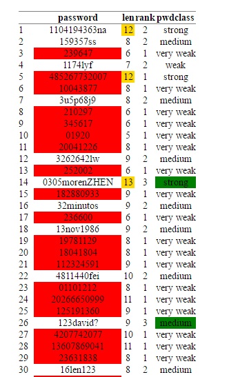
password strength HTMl table
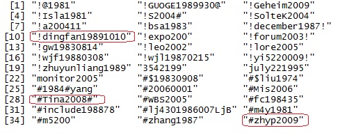
password strength HTMl table

Machine Learning Algorithms

In the last few posts, we saw standalone analytics projects to perform sentiment analysis, visually explore large datasets for insights  and create interesting Shiny applications.

In the coming months however, we will cover how to implement machine learning algorithms in depth. We will explore the underlying concepts behind the algorithm, (why and how the formula works) , implement using a real-world Kaggle dataset and also learn about limitations and advantages.


What algorithms will we cover?

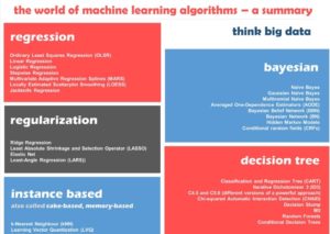
There are many algorithms to choose from, and this infographic from ThinkBigData provides an excellent and comprehensive list. Feel free to use as a handout or print one for your cubicles! For our purposes, we will cover two algorithms from each category.

Categories of machine learning algorithms

Categories of machine learning algorithms. Source – ThinkBigData.com, by author Anubhav Srivastava.


Quick FAQ – selecting algorithm in practice

Many readers often ask, “how do I understand which algorithm to select? ” And this is also where new programmers often get stuck.

The long-winded answer is there is no secret sauce, and unfortunately often comes from experience or the problem definition itself.

The above answer is not very satisfying, so here are two “cheat-sheet” answers:

  1. A good approximation is given by this infographic by Microsoft Azure is a great example.  Download it from Link here. 
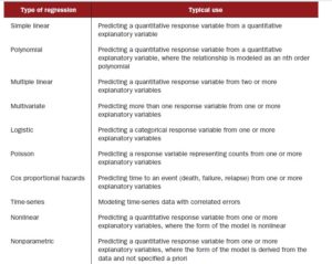
  2. Regression is a very common and flexible model, so the table below provides idea to create a base model based on whether your target variable is qualitative (numeric) or categorical (e.g gender or country)

    regression algorithms

    regression algorithms based on target variables


US Presidential Elections – Roundup of Final Forecasts

With barely 48 hours remaining for the US Presidential Elections, I thought a roundup post curating the “forecasts” seemed inevitable.

So here are the analysis from 3 Top Forecasters, known for their accurate predictions:

US Presidential Elections 2016

US Presidential Elections 2016


(1) Nate Silver, FiveThirtyEight:

This website has been giving a running status of the elections and has been accounting for the numerous pendulum swing (and shocking) changes that have characterized this election. Currently, it shows Hillary Clinton to be the clear winner with a ~70% chance of being the next President. You can check out the state-wise stats and electoral vote breakdown in their webpage here.  If you are interested you can also view their forecasts using 3 different models: polls only, polls+forecast and now-cast (current sentiment) and how they have changed over the last 12  months.

Their analytics are pretty amazing, so do take a look as a learning exercise, even if you do not agree with the forecast itself!


(2) 270towin:

Predictions and forecasts from Larry Sabato and the team at the University of Virginia Center for Politics. The final forecast from this team also puts Ms. Clinton as the clear winner.  They also expect Democrats to take control over the Senate. You can view their statewise electoral vote predictions here.


(3) Dr. Lichtman’s 13-key system:

Unlike other statistical teams and political analysts, this distinguished professor of history at American University, rose to fame using a simplified 13-key system for predicting the Presidential Elections. According to Dr. Allan J. Lichtman’s theory, if six or more questions are answered true, then the party holding the White House will be toppled from power. His system has been proven right for the past 30 years, so please do take a look at it before you scoff that it does not contain the mathematical proof and complex computations touted by media houses and political analytics teams. Dr. Allan J. Lichtman predicts  Trump to be the winner,  as he shows six of the questions are currently TRUE. Read more about this system and the analysis here.


Overall: 

Finally, looking at the overall sentiment on Twitter and news media, it does look like Hillary’s win is imminent.

But until the final vote is cast, who knows what may change?

Crime Density Area Contour Map

Hello All,

Today’s post is related to geographical heat maps – where a specific variable (say ethic groups, art colleges or crime category) is color coded to show areas  of high or low concentration.

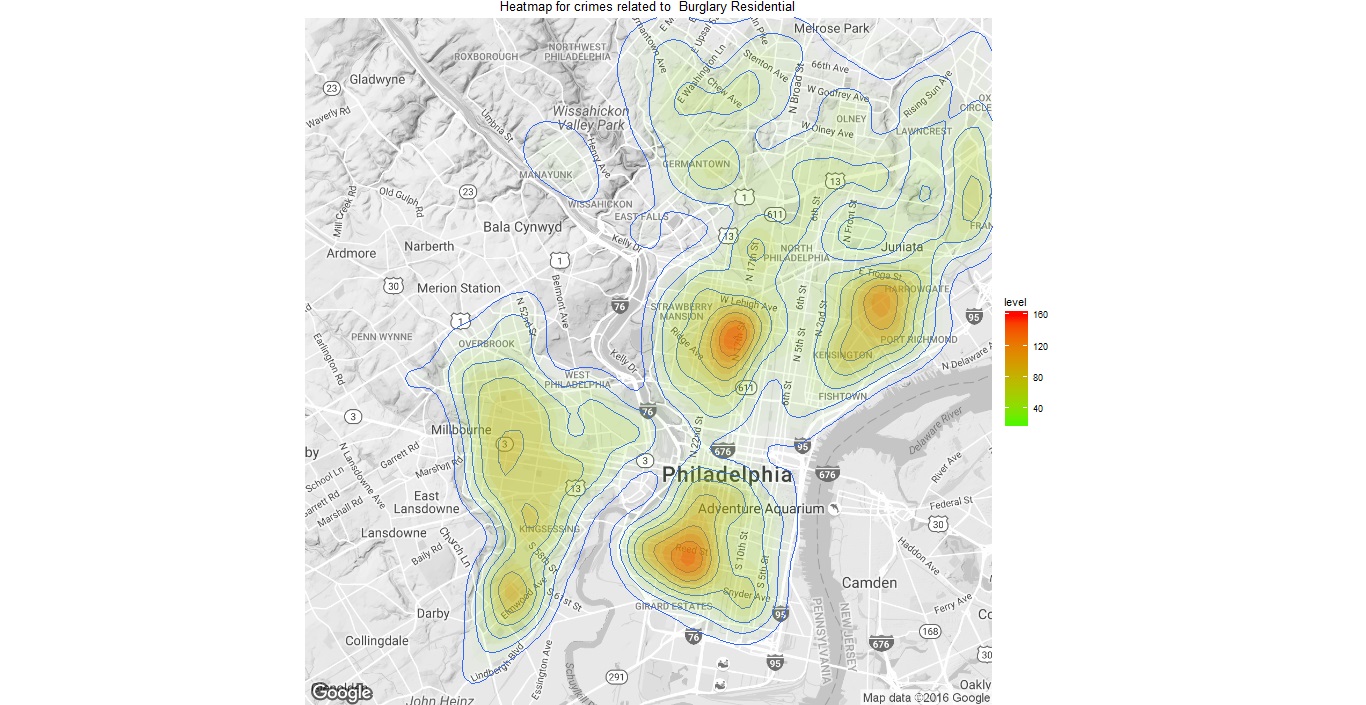
The dataset is from the Philadelphia crime database, generously posted on Kaggle. I’m using the geographical coordinates available in this file to plot crime density maps for 4 specific crime categories. A simple function is created which takes the “crime category” as input and returns a contour map, using the ggmap library.

A detailed instruction is already posted as an RMarkdown file on the RPubs website. Please take a look at the link here.

The entire source code is also available for philly_crime_density_maps as a zipped file which includes – R program (easy to modify and play with the data!), the RMarkdown file. Please remember to add the dataset .csv file  from the Kaggle website and store in the same directory.

Philly Burglary-prone area maps

Burglary crime density area maps for Philadelphia

If you liked this post, and would like to receive updates for similar projects then please do signup for our blog updates. New projects are also added on our parent site at the beginning of every month, so do subscribe! If you think others may find this site, then please do share this link on Twitter and other social media! Thank you.

We love hearing feedback and questions. If you have any tips or would have taken a different approach please do share your thoughts in the comments section.

Happy Coding!

Twitter Sentiment Analysis

Introduction

Today’s post is a 2-part tutorial series on how to create an interactive ShinyR application that displays sentiment analysis for various phrases and search terms. The application accepts user a search term as input and graphically displays sentiment analysis.

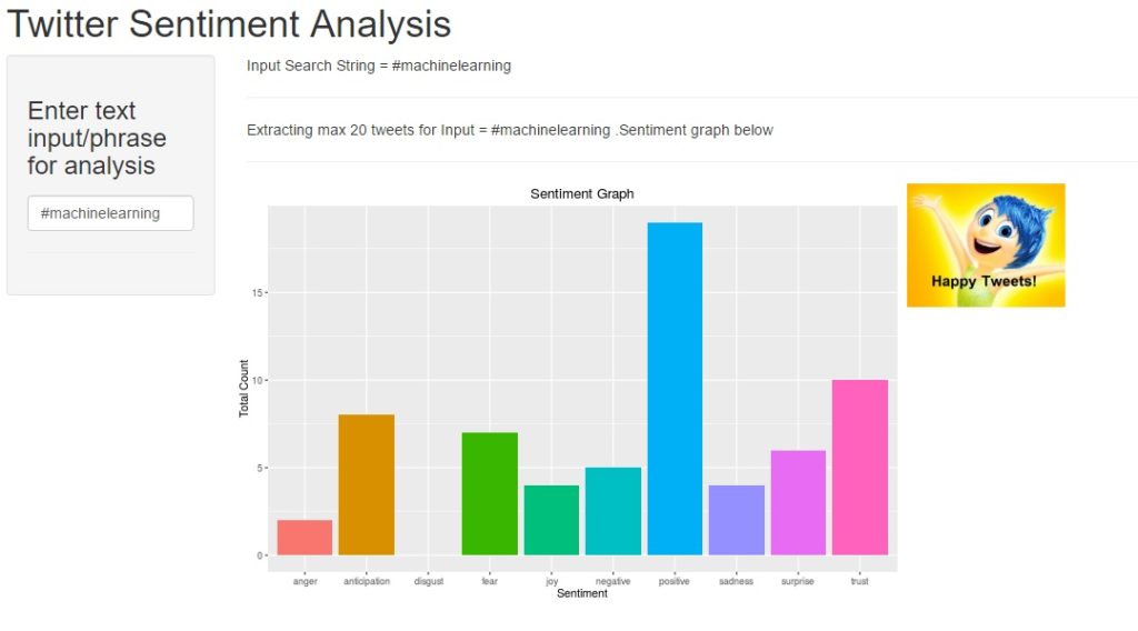
In keeping with this month’s theme – “API programming”, this project uses the Twitter API to perform real-time search for tweets containing the user input term. Live App Link on Shiny website is provided and screenshot is as follows:

Twitter Sentiment Analysis Shiny

Shiny application for Twitter Sentiment Analysis

The project idea may seem simple at first, but will teach you the following skills:

  • working with Twitter API and dynamic data streaming (every time the search term changes, the program sends a new request to Twitter for relevant tweets),
  • Building an “interactive”, real-time application in Shiny/R,
  • data visualization with R

As always, the entire source code is also available for download on the Projects Page or can be forked from my  Github account here.


The tutorial is divided into  3 parts :

  1. Introduction
  2. Twitter Connectivity & search
  3. Shiny design


Application Design:

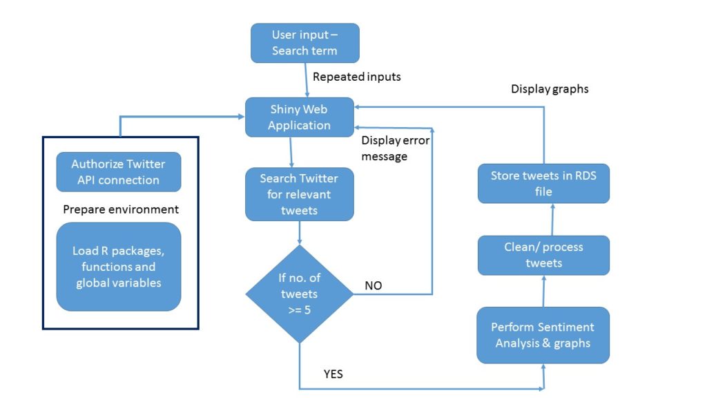
Any good software project begins with the design first. For this application, the design flowchart is shown below:

Design Flowchart for Shiny app

Design Flowchart for Shiny app


Twitter Connectivity

This is similar to the August project and mainly consists of two calls to the Twitter API:

  • authorize twitter api to mine data, using setup_twitter_oauth() function and your Twitter developer keys.

library(twitteR)
consumer_key = “ckey”
consumer_secret = “csecret”
access_token = “atoken”
access_secret = “asecret”
setup_twitter_oauth(consumer_key, consumer_secret, access_token, access_secret)

  • check whether the input search term returns tweets containing the phrase. If number of tweets <=5 return an error message. If number of tweets >5, process the tweets and display a sentiment analysis barchart. A custom function performs this computation

chk_searchterm <- function( term )

{  tw_search = searchTwitter(term, n=20, since=’2013-01-01′)

# look for all tweets containing this search term.

if(length(tw_search) <= 5)

{   return_term <- “None/few tweets to analyse for this search term. Please try again!” }

else

{    return_term <- paste(“Extracting max 20 tweets for Input =”, term, “.Sentiment graph below “)     }

return(return_term)

}

The bargraph is created by assigning numeric values for each of the positive and negative emotions using the tweet text. Emotions used – anger, anticipation, disgust, joy, sadness, surprise, trust, overall positive and negative sentiment.


Shiny webapp

The actual Shiny application design and twitter connectivity are explained in the next post.

« Older posts Newer posts »
Twitter
Visit Us
Follow Me
LinkedIn