Anthony Bourdain was an amazing personality – chef, author, world traveler, TV showhost. I loved his shows as much for the exotic locations as for the yummilicious local cuisine. So I was delighted to find a dataset that included all travel location data, from all episodes of his 3 hit TV shows. Dataset attributed to Christine Zhang for publishing the dataset on Github.
In today’s tutorial, we are going to plot this extraordinary person’s world travels in R. So our code will cover geospatial data mapping using 2 methods:
- Leaflets package to create zoomable maps with markers
- Airplane route style maps to see the paths traveled.
Step 1 – Prepare the Workspace
Here we will load all the required library packages, and import the dataset.
places <- data.frame(fread(‘bourdain_travel_places.csv’), stringsAsFactors = F)
Step 2 – Basic Exploration
Our dataset has data for 3 of Bourdain’s shows:
- No Reservations
- Parts Unknown – which I personally loved.
- The Layover
Let us take a sneak peak into the data:

How many countries did Bourdain visit? We can calculate this for the whole dataset or by show:
numshow <- sqldf(“select show , count(distinct(country)) as num_ctry from places group by show”) # Num countries by show.
numctry <- nrow(table(places$country)) # Total countries visited
numstates <- nrow(table(places$state[places$country == ‘United States’])) ## Total states visited in the US.
Wow! Bourdain visited 93 countries overall, and 68 countries for his show “No Reservations”. Talk about world travel.
I did notice some records have state names as countries, for example California, Washington and Massachussets. But these are exceptions, and overall the dataset is extremely clean. Even disregarding those records, 80+ countries is nothing to be scoffed at, and I had never even heard of some of these exotic locations.
P.S.: You know who else gets to travel a lot? Data scientists earning $100k+ per year. Here’s my new book which will help you how to land such a dream job.
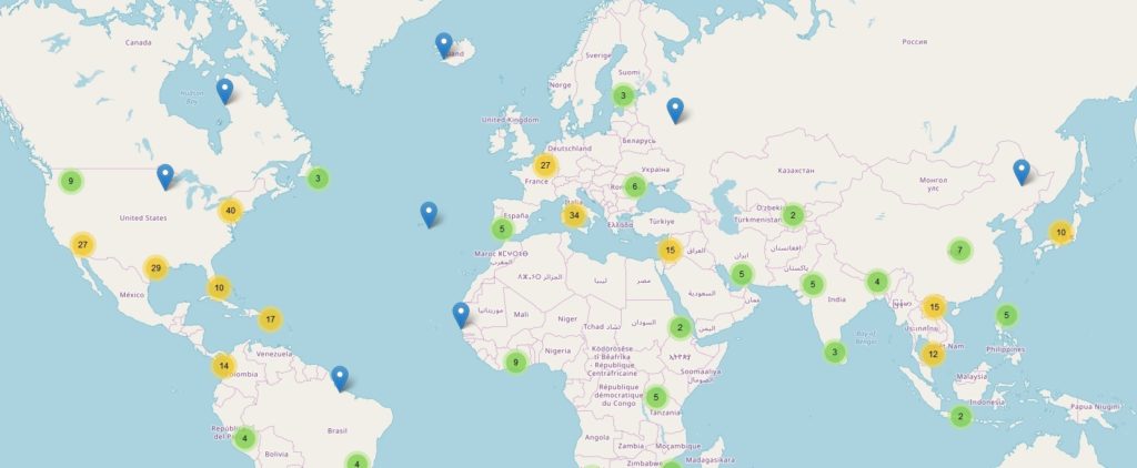
Step 3 – Create a Leaflet to View Sites on World Map
Thankfully, the data already has geographical coordinates, so we don’t need to add any processing steps. However, if you have cities which are missing coordinates then use the “worldcities” file from the Projects page under “Rent Analysis”.
We do have some duplicates, where Bourdain visited the same location in 2 or more shows. So we will de-duplicate before plotting.
Next we will add an info column to list the city and state name that we can use on the marker icons.
places4$info <- paste0(places4$city_or_area, “, “, places4$country) # marker icons
mapcity <- leaflet(places4) %>%
setView(2.35, 48.85, zoom = 3) %>%
addTiles() %>%
addMarkers(~long, ~lat, popup = ~info,
options = popupOptions(closeButton = T),
clusterOptions = markerClusterOptions())
mapcity # Show the leaflet

Step 4 – Flight Route View
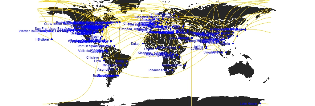
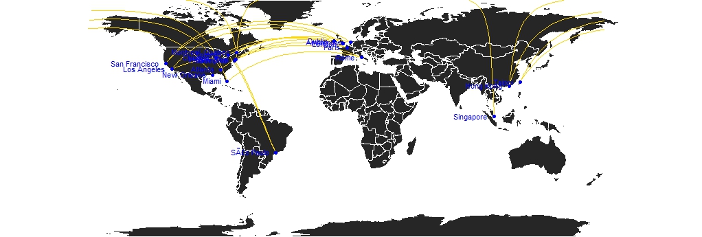
Can we plot the cities in flight view style? Yes, we can as long as we transform the dataframe where each record has a departure and arrival city. We do have the show and episode number so this is quite easy.
Once we do that we will use a custom function which basically plots a circle marker at the two cities and a curved line between the two.
plot_my_connection=function( dep_lon, dep_lat, arr_lon, arr_lat, …){
inter <- gcIntermediate(c(dep_lon, dep_lat), c(arr_lon, arr_lat), n=50, addStartEnd=TRUE, breakAtDateLine=F) inter=data.frame(inter) diff_of_lon=abs(dep_lon) + abs(arr_lon) if(diff_of_lon > 180){
lines(subset(inter, lon>=0), …)
lines(subset(inter, lon<0), …)
}else{
lines(inter, …)
}
} # custom function
For the actual map view, we will create a background world map image, then use the custom function in a loop to plot each step of Bourdain’s travels. Depending on how we create the transformed dataframe, we can plot Bourdain’s travels for a single show, single season or all travels.
Here are two maps separately for the show “Parts Unknown” and “The Layover” respectively. Since the former had more seasons, the map is a lot more congested.

par(mar=c(0,0,0,0)) # background map
map(‘world’,col=”#262626″, fill=TRUE, bg=”white”, lwd=0.05,mar=rep(0,4),border=0, ylim=c(-80,80) ) # other cols = #262626; #f2f2f2; #727272
for(i in 1:nrow(citydf3)){
plot_my_connection(citydf3$Deplong[i], citydf3$Deplat[i], citydf3$Arrlong[i], citydf3$Arrlat[i],
col=”gold”, lwd=1)
} # add every connections:
points(x=citydf$long, y=citydf$lat, col=”blue”, cex=1, pch=20) # add points and names of cities
text(citydf$city_or_area, x=citydf$long, y=citydf$lat, col=”blue”, cex=0.7, pos=2) # plot city names

As always, the code files are available on the Projects Page. Happy Coding!
Call to Action:
If you read this far and also want a job or promotion in the DataScience field, then please do take a look at my new book “Data Science Jobs“. It will teach you how to optimize your profile to land great jobs with high salary; 100+ interview Qs and niche job sites which everybody else overlooks.
