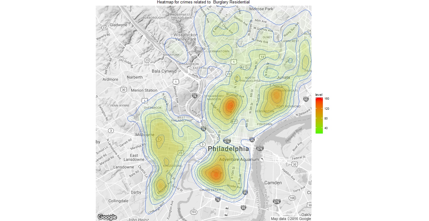
With barely 48 hours remaining for the US Presidential Elections, I thought a roundup post curating the “forecasts” seemed inevitable.
So here are the analysis from 3 Top Forecasters, known for their accurate predictions:
US Presidential Elections 2016
(1) Nate Silver, FiveThirtyEight:
This website has been giving a running status of the elections and has been accounting for the numerous pendulum swing (and shocking) changes that have characterized this election. Currently, it shows Hillary Clinton to be the clear winner with a ~70% chance of being the next President. You can check out the state-wise stats and electoral vote breakdown in their webpage here. If you are interested you can also view their forecasts using 3 different models: polls only, polls+forecast and now-cast (current sentiment) and how they have changed over the last 12 months.
Their analytics are pretty amazing, so do take a look as a learning exercise, even if you do not agree with the forecast itself!
(2) 270towin:
Predictions and forecasts from Larry Sabato and the team at the University of Virginia Center for Politics. The final forecast from this team also puts Ms. Clinton as the clear winner. They also expect Democrats to take control over the Senate. You can view their statewise electoral vote predictions here.
(3) Dr. Lichtman’s 13-key system:
Unlike other statistical teams and political analysts, this distinguished professor of history at American University, rose to fame using a simplified 13-key system for predicting the Presidential Elections. According to Dr. Allan J. Lichtman’s theory, if six or more questions are answered true, then the party holding the White House will be toppled from power. His system has been proven right for the past 30 years, so please do take a look at it before you scoff that it does not contain the mathematical proof and complex computations touted by media houses and political analytics teams. Dr. Allan J. Lichtman predicts Trump to be the winner, as he shows six of the questions are currently TRUE. Read more about this system and the analysis here.
Overall:
Finally, looking at the overall sentiment on Twitter and news media, it does look like Hillary’s win is imminent.
But until the final vote is cast, who knows what may change?