Hello All,
Today’s post is related to geographical heat maps – where a specific variable (say ethic groups, art colleges or crime category) is color coded to show areas of high or low concentration.
The dataset is from the Philadelphia crime database, generously posted on Kaggle. I’m using the geographical coordinates available in this file to plot crime density maps for 4 specific crime categories. A simple function is created which takes the “crime category” as input and returns a contour map, using the ggmap library.
A detailed instruction is already posted as an RMarkdown file on the RPubs website. Please take a look at the link here.
The entire source code is also available for philly_crime_density_maps as a zipped file which includes – R program (easy to modify and play with the data!), the RMarkdown file. Please remember to add the dataset .csv file from the Kaggle website and store in the same directory.
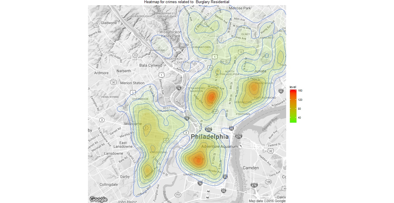
Burglary crime density area maps for Philadelphia
If you liked this post, and would like to receive updates for similar projects then please do signup for our blog updates. New projects are also added on our parent site at the beginning of every month, so do subscribe! If you think others may find this site, then please do share this link on Twitter and other social media! Thank you.
We love hearing feedback and questions. If you have any tips or would have taken a different approach please do share your thoughts in the comments section.
Happy Coding!
