Twitter Analysis – Rio2016
Olympics season is in full swing. In keeping up with the spirit of this pinnacle of sports, we will use the Twitter API to extract tweets related to Rio2016 and analyze them to extract insights.
 In this post we will perform the following tasks:
- extract tweets containing the tag “#TeamUSA”,
- analyze tweets graphically on various factors,
- perform a sentiment analysis indicating overall emotions associated with such tweets.
- *IMPORTANT* learn how some of these steps can be used to monitor your brand and extract customer sentiment.
Step 1 – Connecting to Twitter API
We will use R programming to perform the analysis using Twitter API keys (learn more about how to request these keys here) and the amazing “TwitterR” package to gain clearance permission for data extraction from the Twitter website.
Code for authorization is below:
Step 2 – Search Twitter API for specific tags
We will search Twitter for all tweets with the tag “#TeamUSA”.
Twitter puts some constraints on how much data can be extracted with each API call, so we limit our search to 2000 tweets. To ensure recency, we specify the tweets should have been posted after Aug 1, 2016. Code snippet below:
Note, the “geocode” option is optional in above command, but I added it to consider tweets from users whose profile location is Philadelphia, ensuring coverage by NBC/Fox are definitely picked up! We save the tweets in a RDS file for easy access.
Step 3 – Cleaning up and processing the tweets
First, we remove all special characters and emojis from tweets using the sapply() and iconv() function.
We convert the created time to Brazil time. Note, Rio de Janeiro follows Chicago timezone, i.e 1 hour behind Philadelphia/NYC.
2
tweet_doc$strptime = as.POSIXct(strptime(tweet_doc$Riotime, "%Y-%m-%d %H:%M:%S"))
The as.POSIXct() allows us to aggregate tweets by hour/ date / minute, etc. which we can derive as below:
We add a new variable to determine digital device type used for these Tweets, using the device url Twitter provides under column “StatusSource”.
2
3
tweet_doc$statusSource_new = substr(tweet_doc$statusSource, regexpr('>', tweet_doc$statusSource) + 1,
regexpr('</a>', tweet_doc$statusSource) - 1)
Step 4 – Graphical Insight
Plot 1: Tweets by hour of day:
2
ggplotly(gptime)
We notice that number of tweets increase as the evening passes with peak frequency at about 9 pm CDT. (graph below)
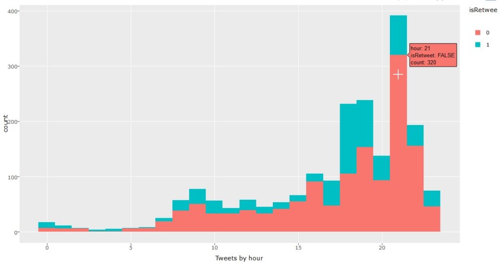
#TeamUSA tweets by hour
Plot 2: Tweets by device type:
2
ggplotly(gp)
The graph clearly shows iphones dominating the user base.
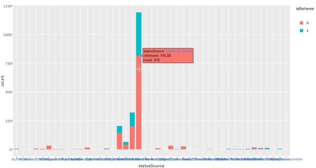
Tweets by device used
Plot 3: Emotional Valence
We extract the emotional sentiment of tweets using a custom function:
2
3
4
5
6
7
8
9
# strip sentence enders so each tweet is analyzed as a sentence,
# and +'s which muck up regex
gsub('(\\.|!|\\?)\\s+|(\\++)', ' ', txt) %>%
# strip URLs
gsub(' http[^[:blank:]]+', '', .) %>%
# calculate polarity
polarity()
})
Applying this, we get the most positive tweet:
“That looked like a very easy win for #TeamUSA #beachvolleyball #Rio2016”
most negative tweet:
I think it’s a very odd sport but damn those guys are fit #Rio2016 #waterpolo #TeamUSA
Last, we plot a graph to display how emotionalValence change over the day:
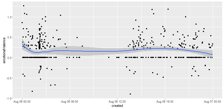
Emotional valence change in tweets
Plot 4 : Word Cloud:
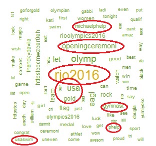
word cloud for #teamUSA tweets
We use the “text” column from tweet_doc object to create a word dictionary of the tweets after removing punctuation and unwanted characters. The size of the words increases with their frequency of appearance in the tweets. The image alongside shows such a wordcloud with highlighted words indicating high-frequency phrases.
2
3
4
wordCorpus <- tm_map(wordCorpus, removePunctuation)
wordcloud(words = wordCorpus, max.words=500, random.order=FALSE,
rot.per=0.35, use.r.layout=FALSE, colors=pal)
Plot 4 : Sentiment Graph:
We use the “syuzhet” library to assigns emotional value to each of the 2000 tweets we extracted using the get_nrc_sentiment() function.
This assigns a numeric value to each tweet to indicate various emotions expressed in the tweet – anger, anticipation, fear, joy, etc. We then add these values back to the tweet_doc object and compute column totals to derive the overall weight for each emotion. Code and image for overall sentiment scores are shown below:
2
3
4
geom_bar(aes(fill = sentiment), stat = "identity") +
theme(legend.position = "none") +
xlab("Sentiment") + ylab("Total Count") + ggtitle("Total Sentiment Score for All Tweets"))
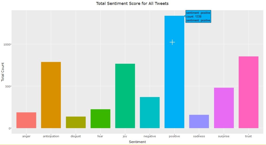
Overall Sentiment Scores – #TeamUSA
We can also use the scores to see if positive/negative sentiments change with time of day or date. For our tag “#TeamUSA” we notice this is patently true as seen in graph below:
Positive tweets peak at noon on Opening Ceremony day (aug 5) and negative sentiments peaked on Aug 7 morning.
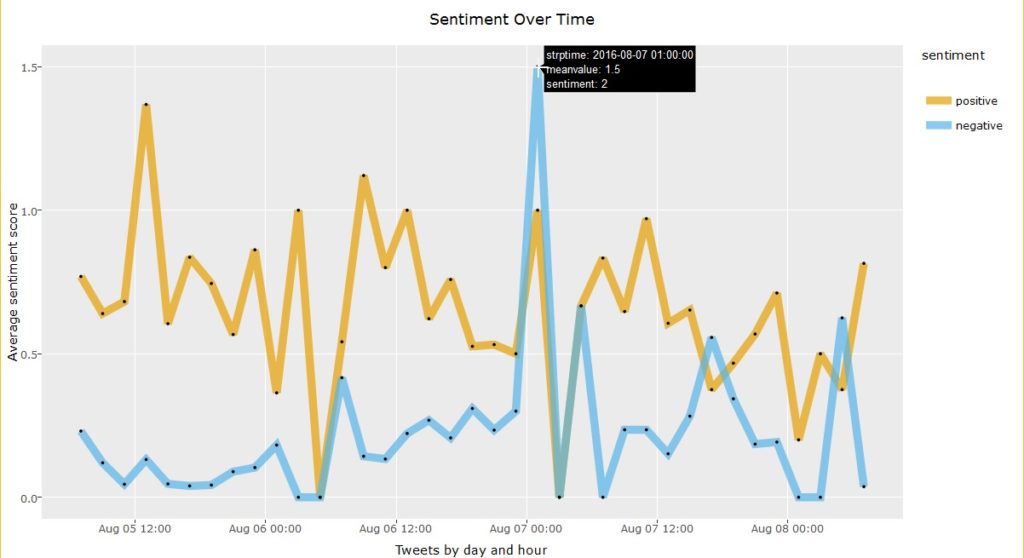
Sentiment by time
Step 5 – Usage for Brand monitoring.
The steps used in the analysis above can be easily modified for monitoring your brand, blog or product, as explained below:
- Instead of “#TeamUSA” we can use any other tag or company/blog name or product or any other relevant tags to mine Twitter for tweets.
- Periodically monitor the tweets about your product or brand to ensure that your “sentiment graph” always tends to positive emotions. If not, ensure your staff is working diligently to counter any negative tweets/ concerns among your users.
- The graphical analysis for “Tweets by hour of day ” could be used to monitor what time your users/ audience is most active. You could use this insight to publish more content during this time and to ensure your customer support is always available during this period to effectively engage your audience.
- If your “device type” graph indicates any specific device (e.g: specific Android phone brands) make sure your content caters correctly for mobile users.
- The high-frequency words in “wordcloud” indicate trending topics, so these can be used as great ideas for new content topics or short-term ads to ride the publicity wave! 🙂
The entire source code for this analysis is available here blog_twitter_olympics or can be forked from the Github page. Please take a look and share your thoughts and feedback. Until next time, adieu! 🙂
