Deep dive into data analysis tools, theory and projects

Category: Data visualization (Page 2 of 3)

Tutorials – Dashboards with R programming

In this blogpost we are going to implement dashboards using R programming, using the latest R library package “flexdashboard”.

R programming already offers some good features for graphs and charts (packages like ggplot, leaflet, etc). Plus there is always the option to create web applications using the Shiny library and presentations with RMarkdown documents.

However, this new library leverages these libraries and allows us to create some stunning dashboards, using interactive graphs and text. What I loved the most, was the “storyboard” feature that allows me to present content in Tableau-style frames. Please note that for this you need to create RMarkdown (.Rmd) files and insert the code using the R chunks as needed.

Do I think it will replace Tableau or any other enterprise BI dashboard tool? Not really (at least in the near future). But I do think it offers the following advantages:

  1. great alternative to static presentations since your audience can interact with the data.
  2. RMarkdown allows both programming and regular text content to be pooled together in a single document.
  3. Open source (a very big plus, in my opinion!)
  4. Storyboard format allows you to logically move the audience through the analysis : problem statement, raw data and exploration, different parts of the models/simulations/ number crunching, patterns in data, final summary and recommendations. Presenting the patterns that allow you to accept or reject a hypothesis has never been easier.

So, without further ado, let us look at the dashboard implementation with two examples:

  1. Storyboard dashboard.
  2. Simple dashboard with Shiny elements.

Library Installation instructions:

To start off, please install the “flexdashboard” package in your RStudio IDE. If installation is completed correctly, you will see the flex-dashboard feature when you create a new RMarkdown document, as shown in images below:

Step1 image:

Step 2 image:

Storyboard Dashboard:

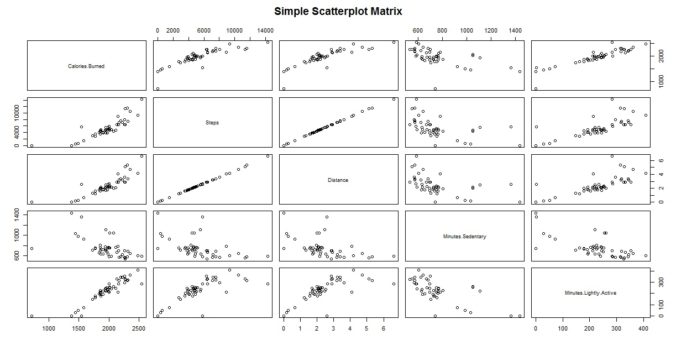
Instead of analyzing a single dataset, I have chosen to present different interactive graph types using the storyboard feature. This will allow you to experience the range of options possible with this package.

An image of the storyboard is shown below, but you can also view the live document here (without source code or data files) .  The complete data and source code files are available for download here, simply search for “Dashboard Codefiles” on the Projects page.

The storyboard elements are described below:

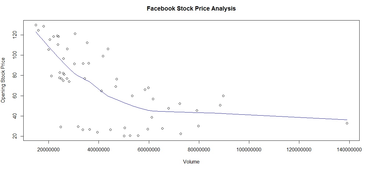
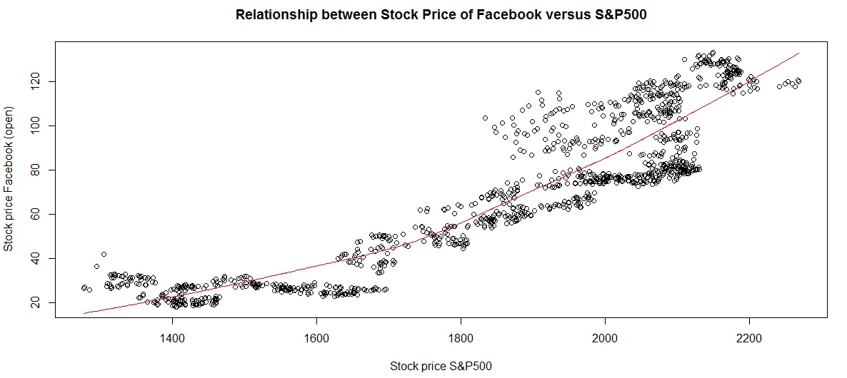
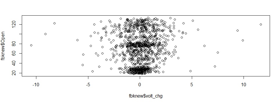
  • Element 1 – Click on each frame to see the graph and explanation associated with that story point. (click element 5 to see Facebook stock trends)
  • Element 2 – This is the location for your graphs, tables, etc. One below each story point.
  • Element 3 – This explanation column in the right can be omitted, if required. However, my personal opinion is that this is a good way to highlight certain facts about the graph or place instructions, hyperlinks, etc. Like a webpage sidebar.
  • Element 4 – My tutorial only has 4 story elements, but if you have more flexdashboard automatically provides left-right arrow for navigation. (Just like Tableau).
  • Element 6 – Title bar for the project. Notice the social sharing button on the far right.

Shiny Style Simple Dashboard:

Here I have used Shiny elements to allow user to select the variables to plot on a graph. This also shows how you can divide your page into columns and rows, to show different content in different panes.

See image below for some of the features incorporated in this dashboard:

Feature explanation:

  • Element 1 – Title pane. The red color comes from the “cerulean” theme I used. You can change colors to match your business logo or personal preferences.
  • Element 2 – Shiny inputs. The dropdown is populated automatically from the dataset, so you don’t have to specify values separately.
  • Element 3 – Output graph, based on choices from element 1.
  • Element 4 – notice how this is separated vertically from element3, and horizontally from element 5.
  • Element 5 – Another graph. You can render text, image or pull in web content using the appropriate Shiny commands.
  • Element 6 – you can embed social share button, and also the source code. Click the code icon “</>” to view the code. You can also download the data and program files here, from my  Projects page.

Hope you found these dashboard implementations useful. Please add your valuable comments and feedback in the comments section.

Until next time, happy coding! ?

Analyzing Fitbit Data with R

Hello All,

First of all, Happy New Year! Wishing you all a fantastic year in 2017 and hope you achieve all your goals for this year, and much more! 🙂

Most people’s New Year Resolutions are related to health, whether it going to the gym, eating healthy, walking more, reducing that stubborn belly fat or something similar. Since I bought a Fitbit Charge2 fitness tracker late this year, I thought it would be an interesting idea to base this month’s project on the data.
The entire codebase, images and datafiles are available at this link on a new Projects Page.


Project Overview:

The project consists of 3 parts:

  1. Scraping the Fitbit Site:  for “sleep quality” data. If you log in to the Fitbit site, they do allow export of exercise, sleep duration and some other data. However, crucial data like heartrate during activities, number of movements during the night, duration of restless sleep, etc are completely missing! I realize not everyone has a Fitbit, so I’ve added some datafiles for you to experiment. However, you can use the logic to scrape other sites in a similar fashion since I am using my login credentials. (similar to API programming explained in these posts on Twitter and Yelp API)
  2. Aggregating downloaded data:  We also download  data freely available on the website itself and then aggregate them together , selecting only the data we want. This  step is important  because in the real-world, data is rarely found in a single repository. Data cleansing, derived variables and other processing steps will happen in this section.
  3. Hypothesis testing: In this part, we will try to understand what factors affect sleep quality. Does it depend on movements during the night,  is there better sleep on weekend nights, etc.?  Does exercising more increase sleep quality?


Section 1:

Scraping the Fitbit site was made extremely easy thanks to the package “fitbitScraper”. In our program file “fitbit_scraper.R”, we extract sleep related data for the month of Nov and Dec 2016.

sleep_datafile

sleep_datafile

Section 2:

We combine the data from the web scraper, heartrate and exercise datafiles. We now have data for 2 months regarding the following variables:

  • sleep duration / start/ end time, sleep quality
  • number of movements during the night, number of times awake, duration of both.
  • Calories_burnt/ day, number of minutes performing light/ moderate/ heavy exercise,
  • weekday, date , month.
Fitbit dataset

Fitbit dataset

final datafile Fitbit trackerfinal datafile Fitbit tracker

final datafile Fitbit tracker


Section 3:

Using the above data, we use hypothesis testing methods (anova, correlation and chi-square testing ) to understand patterns in our data.

Once you run the code, you will observe the following results:

  1. Number of times awake increase when daily steps are between 4000-7000 steps.
  2. Weekends do NOT equate to better sleep, even though duration of sleep is higher.
  3. Sleep quality is WORST when number of movements is <10 during the night. This may seem counter-intuitive, but I know from personal experience that on the days when I am  stressed out, I sleep like a robot in one position throughout the night. The data seems to support this theory as well. 🙂
  4. Number of calories burnt is highest during weekends (unsurprising), followed by Tuesday.

Apart from the statistical tests, we also use data visualizations to double-check our analysis. Some plots are given below:

correlation diagram

correlation diagram


steps versus sleep_quality

steps versus sleep_quality


anova

anova


relationships between variables

diagram to view relationships between variables


Once again, feel free to download the code and play with the data. Share your thoughts and experiences in the comments section.

Until next time, adieu!

Stock Price Analysis – Linear Regression Model in 5 simple steps

In this post we are going to analyze stock prices for company Facebook and create a linear regression model.


Code Overview:

Our code performs the following functions. You can download the code here.

  1. Load original dataset.
  2. Add data to benchmark against S&P500 data.
  3. Create derived variables. We create variables to store calculations for the following:
    • Date values: split composite dates into day, month and year.
    • Daily volatility : Price change between daily high and low prices or intraday change in price. A bigger difference signifies heavy volatility.
    • Inter-day price volatility : Price change from previous day
  4. Data visualization to validate relationship between target variable and predictors.
  5. Create Linear Regression Model


Step 1&2 – Load Datasets

We load stock prices for Facebook and S&P500. Note, the S&P500 index prices begin from 2004, whereas Facebook was listed as a public company only in May 2012.
We specify “all.x = TRUE” in the merge command to indicate that we do not want dates which are not present in the Facebook file.

fbknew = merge(fbkdf, sp5k, by = “Date”, all.x = TRUE)

Note, we obtained this data from the Yahoo! Finance homepage using the tab “Historical Data”.


Step 3 – Derived Variables

a) Date Values:
The as.Date() function is an excellent choice to breakdown the date variable into day, month and year. The beauty of this function is that it allows you to specify the format of the date in the original data since different regions format it differently. (mmddyyyy / ddmmyy/ ..)

fbknew$Date2 = as.Date(fbknew$Date, “%Y-%m-%d”)
fbknew$mthyr = paste(as.numeric(format(fbknew$Date2, “%m”)), “-“,
as.numeric(format(fbknew$Date2, “%Y”)), sep = “”)
fbknew$mth = as.numeric(format(fbknew$Date2, “%m”))
fbknew$year = as.numeric(format(fbknew$Date2, “%Y”))

b) Intraday price:

fbknew$prc_change = fbknew$High – fbknew$Low

We have only calculated the difference between the High and Low, but since data is available for “Open” and “Close” you can calculate the maximum range as a self-exercise.
Another interesting exercise would be to calculate the average of both, or create a weighted variable to capture the impact of all 4 variables.

c) Inter-day price:
We first sort by date, using the order() function, and then use a “for loop” to calculate price difference from the previous day. Note, since we are working with dataframes we cannot use a simple subtraction command like x = var[i] – var[i-1]. Feel free to try, the error message is really beneficial in understanding how arrays and dataframes differ!


Step 4 – Data Visualization

Before we create any statistical model, it is always good practice to visually explore the relationships between target variable (here “opening price”) and the predictor variables.

With linear regression model, it is more so, to identify if any variables show a non-linear (exponential, parabolic ) relationship. If you see such patterns you can still use linear regression, after you normalize the data using a log function.

Here are some of the charts from such an exploration between “Open” price (OP) and other variables. Note there may be multiple explanations for the relationship, here we are only looking at the patterns, not the reason behind it.

 a) OP versus Trade Volume:

From chart below it looks like the volume is inversely related to price. There is also one outlier (last data point) . We use the lines() and lowess() functions to add a smooth trendline.
An interesting self-exercise would be to identify the date when this occurred and match it to a specific event in the company history (perhaps the stock split?)

Facebook Stock – Trading Volume versus Opening Stock Price

b) OP by Month & Year:

We see that the stock price has been steadily increasing year on year.

Facebook_stock_price_by_month&and year

Facebook price by month and year

c) OP versus S&P500 index price:

Clearly the Facecbook stock price has a linear relationship with S&P500 index price (logical too!)

FB_stock_S&P500

Facebook stock price versus S&P500 performance

d) Daily volatility:

This is slightly scattered although the central clustering of data points indicates this as a fairly stable.

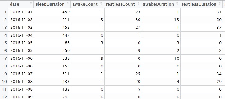
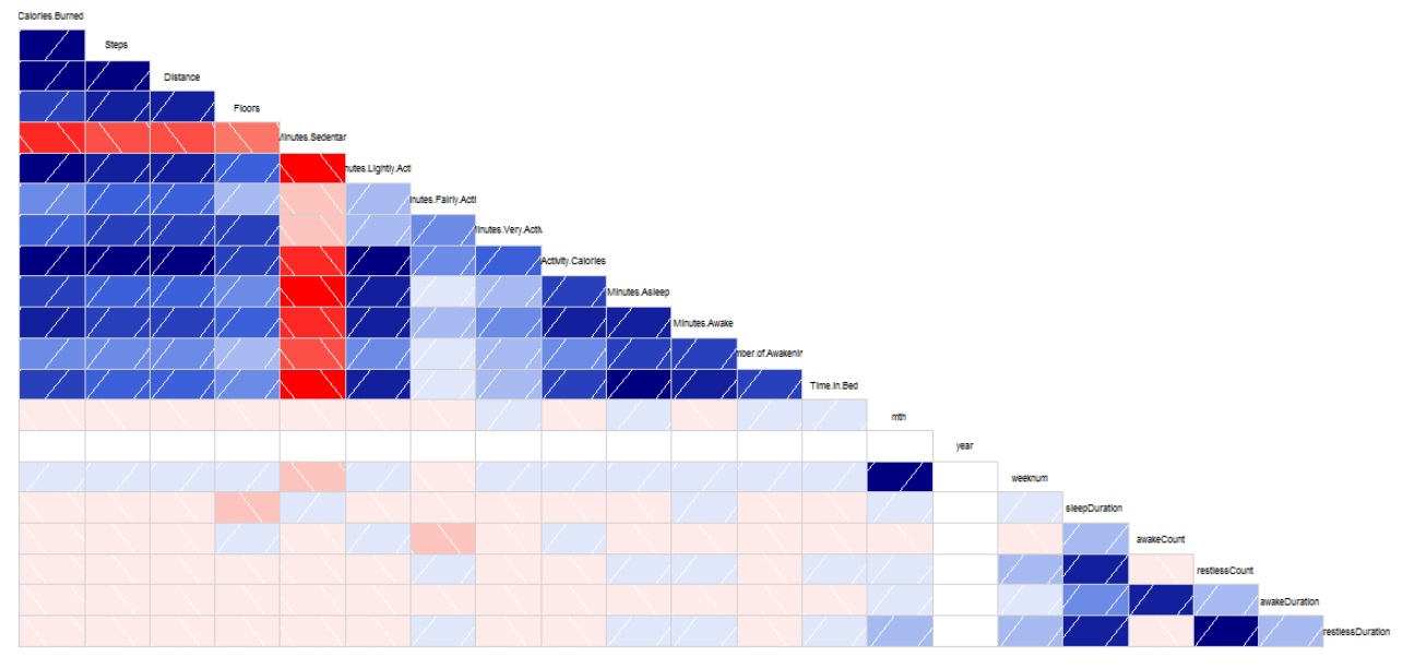
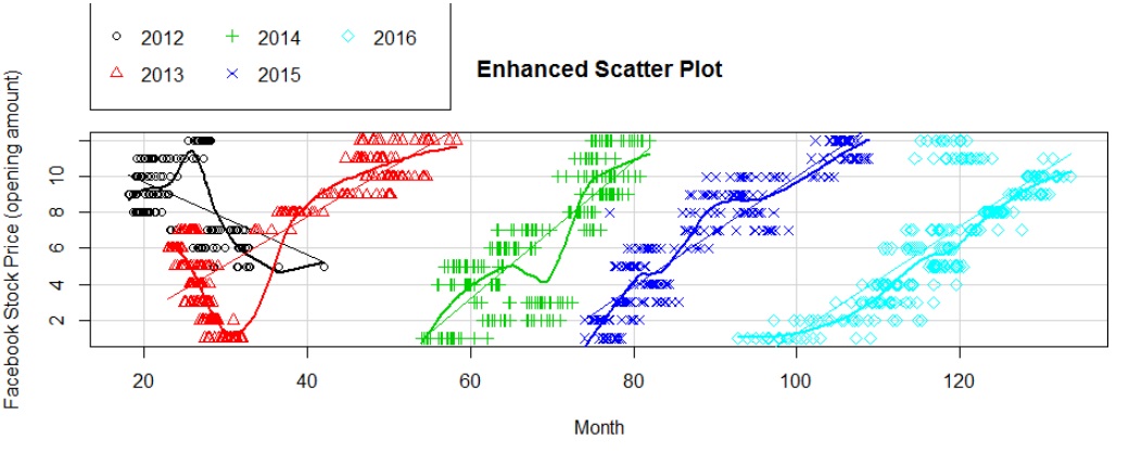
Note, we use the sqldf package to aggregate data by monthyear / month for some of these charts.
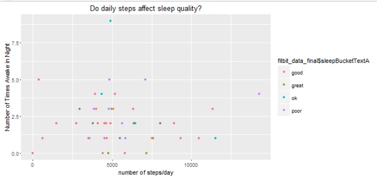
Step 5 – Linear Regression Model

Our model formula is as follows:

lmodelfb = lm(Open ~ High + Volume + SP500_price + prc_change +     mthyr + mth + year + volt_chg,     data = fbknew)
summary(lmodelfb)

We use the summary function to view the intercepts and identify the predictors with the biggest impact, as shown in table below:

predictor variables

We see that price is affected overall by S&P500, interday volatility and trade volume. Some months in 2013 also showed a significant impact.
This was our linear regression data model. Again, feel free to download the code and experiment for yourself.

Feel free to add your own observations in the comments section.

Dec 2016 – Project Updates

Hello All,

password analysis - text processing

password analysis – text processing

Just to notify that the code for monthly projects has been uploaded to the “Projects Page”.

This month’s code focuses on text analytics and includes code for:

  1. Identifying string patterns and word associations.
  2. string searches and string manipulations.
  3. Text processing and cleaning (remove emojis, punctuation marks, etc)
  4. weighted ranking
word association

word association

There are 2 projects, both under the header “TEXT ANALYTICS”, so you need to download two zipped folder using the appropriate download buttons:

  1. Text_analysis code: Detailed explanation given under link.
  2. Code – pwd strength. An explanation is given under this blog post.

Happy Coding! 🙂

Password Strength Analysis – a Tutorial on Text Analysis & String Manipulation

In this post we will learn how to apply our data science skills to solve a business problem – namely why passwords get stolen or hijacked?
This post is inspired from a blog entry on Data Science Central, where the solution was coded in Python. (Our analysis will use R programming and extend the original idea)

In this tutorial, we will explore the following questions:

  1. What are the most common patterns found in passwords?
  2. How many passwords are  banking type “strong ” combinations (containing special characters, length >8) ?
  3. How many passwords make excessive use of repetitive characters, like “1111”, “007”, “aaabbbccc” or similar.


Remember, this is a “real-world” dataset and this type of list is often used to create password dictionaries. You can also use it to develop your own password strength checker.


Overall, this tutorial will cover the following topics:

  1. basic string functions: stringlength, stringsearch, etc.
  2. data visualization using pie charts, histograms,
  3. Color coded HTML tables (similar to Excel) – a great feature if you plan to create Shiny Webapps with Tables.
  4. Weighted ranking.


So let’s get started:


What makes a “Strong” password?

First let us take a look at the minimum requirements of  an ideal password:

  1. Minimum 8 characters in length.
  2. Contains 3 out of 4 of the following items:
    • Uppercase Letters
    • Lowercase Letters
    • Numbers
    • Symbols


Analysis Procedure:


  1. Load input (password data) file:

TFscores = data.frame(fread(“C:/anu/ja/dec2016/passwords_data.txt”, stringsAsFactors = FALSE, sep = ‘\n’, skip = 16))


2. Calculate length of each password:

TFscores$len = str_length(TFscores$password)


3. Plot histogram to see frequency distribution of password lengths. Note, we use a custom for-loop to generate labels for the histogram.

hist(TFscores$len, col = “blue” , ylim = c(0, 150000),

main = “Frequency Distribution – password length”,

xlab = “Password Length”,  ylab = “Count / Frequency”, labels = lendf$labelstr)

Histogram for password lengths

Histogram for password lengths


4.

a. Calculate number of digits in each password.

number of digits in password

number of digits in password

TFscores$strmatch = gsub(pattern = “[[:digit:]]”, replacement = “”, TFscores$password)

TFscores$numberlen = TFscores$len – str_length(TFscores$strmatch)

b. Similarly calculate number of characters from other character classes:

  • Upper case alphabets
  • Lower case alphabets
  • Special characters – ! ” # % & ’ ( ) * + , – . / : ;


5. Assign 1 point as password strength “rank” for every character class present in the password.  As mentioned earlier, an ideal password should have at least 3 character classes.

TFscores$rank = TFscores$urank + TFscores$lrank + TFscores$nrank +   TFscores$srank

Let us take a look to see how the passwords in our list stack up:

pie(piedfchar$Var1,labels = labelarrchar , col=rainbow(9),  main=”no. of Character classes in password”)


password strength analysis

password strength analysis

6. Count number of unique characters in password :


Note, this function is resource intensive, and takes couple of hours to complete due to size of the dataset.
To reduce the time/effort , the calculated values are added to the zipfolder, titled “pwd_scores.csv”.

 length(unique(strsplit(tempx$password, “”)[[1]]))


7. Assign  password strength category based on rank and length:

TFscores$pwdclass = “weak”   #default

TFscores$pwdclass[TFscores$len < 5 | TFscores$rank == 1 ] = “very weak”

TFscores$pwdclass[TFscores$len >= 8 & TFscores$rank >=2] = “medium”

TFscores$pwdclass[TFscores$len >= 12] = “strong”

TFscores$pwdclass[TFscores$len >= 12 & TFscores$rank == 4] = “very strong”

Based on this criteria, we get the following frequency distribution:

password strength

password strength

7. We can derive the following insights from steps 5 and 6:

  • 77.68% of passwords are weak or very weak!
  • ~3% of passwords have less than 5 characters.
  • ~72% of passwords have less only 1 type of character class.
  • 0.5% of passwords have 8+ characters yet number of unique characters is less than 30%.
  • ~0.9% of characters have less than 4 unique characters.
  • 72% of passwords contain only digits.

8. Let’s see if there are any patterns repeated in the passwords, like “12345”, “abcde”, “1111”, etc:

TFscores$strmatch = regexpr(“12345”, TFscores$password)

pwd with years

password with year prefixes.

  • 1.2% of passwords contain pattern “12345”.
  • 0.01% of passwords contain pattern “abcde”.
  • 0.3% of passwords contain pattern “1111”.
  • 0.02% of passwords contain pattern “1234”.
  • 15% of passwords contain year notations like “198*”, “197*”, “199”, “200*”. Sample shown alongside clearly shows that many people use important years from their life for their passwords. (logically true!)


9. View the password strength visually. We use the “condformat” function to create an HTML table that is easy to assimilate:

condformat(testsampledf) +  rule_fill_discrete(password, expression = rank < 2, colours = c(“TRUE”=”red”)) +
rule_fill_discrete(len, expression = (len >= 12), colours = c(“TRUE”=”gold”)) +
rule_fill_discrete(pwdclass, expression = (rank>2 & len>=8) , colours = c(“TRUE”=”green”))

password strength HTMl table

password strength HTMl table

« Older posts Newer posts »
Twitter
Visit Us
Follow Me
LinkedIn